Problems in the philosophers’ playpool
Are there particular periods in history where philosophy flourished? Historians and philosophers will probably already know or have an idea of the answer but I wanted to visualise this in some way. This gave me a chance to revisit my playpool visualisation and to try out the latest feature in Dickie Dates.
Source
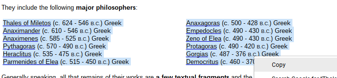
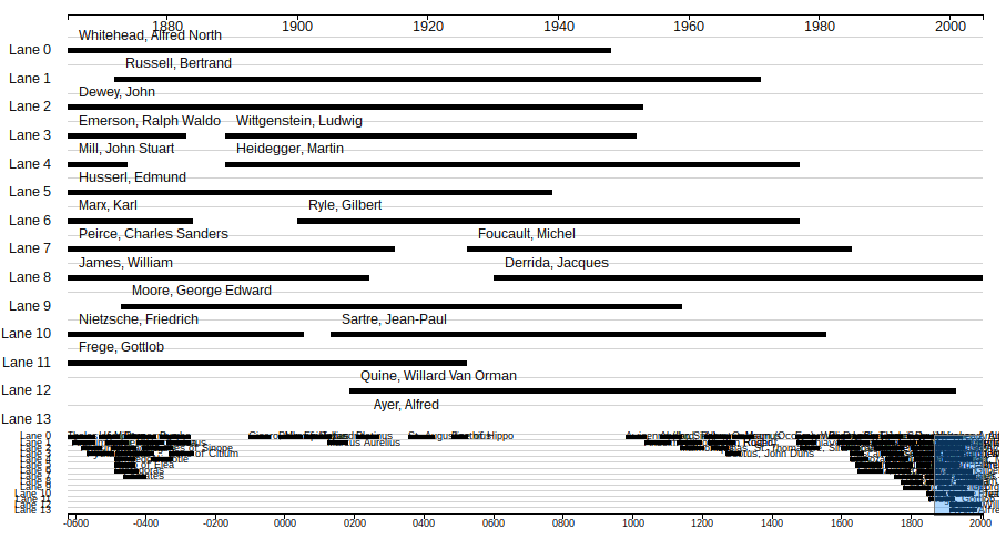
While browsing Quora, I found a link to Luke Mastin’s vertical timeline of Western philosophers. Unfortunately, I can’t remember the original context the link was used in but I started exploring the site which is quite old now but full of information about philosophers throughout history.
I became interested in the idea of being able to see at a glance which periods of history were particularly “good” for philosophy and which periods of history see almost no philosophy recorded.
Creating the playpool
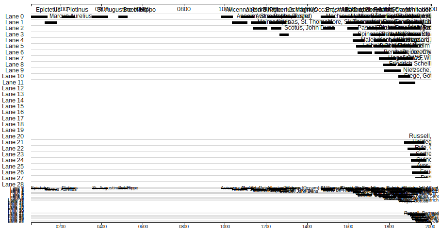
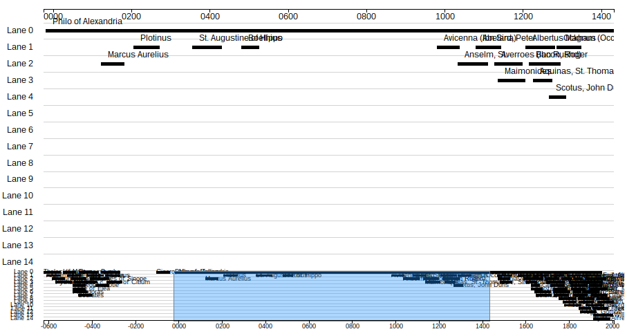
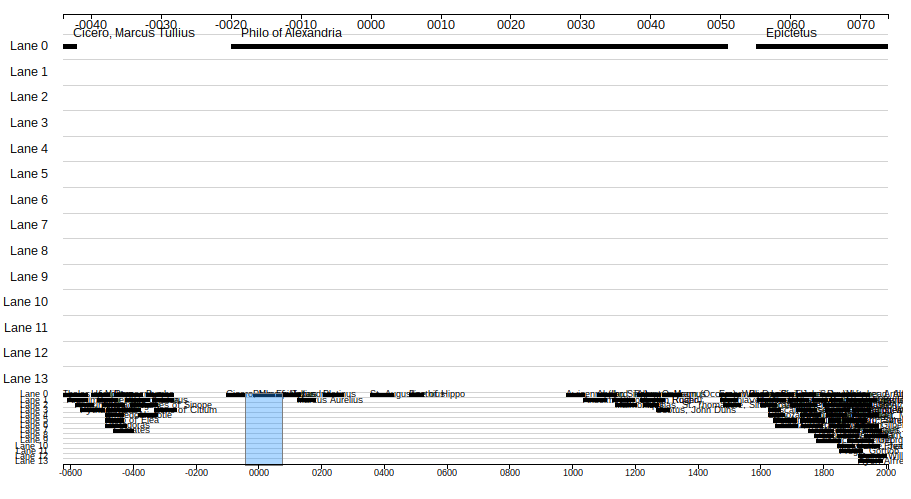
It’s a crude measure but I decided to simply take Mastin’s vertical timeline and recreate it as a “playpool” chart.
Mastin’s chart is already a good example of what I’d like a playpool to do. As my original post on playpool charts attempted to explain, playpool chart is like a swimlane chart where lanes divide different events or data, but instead of the lanes meaning anything specific they are assigned to each datum based on availability.
Browserification of Dickie Dates
In creating this I was able to use the micro-feature I introduced to the Dickie Dates package last week, which I described in my post on representing “ancient dates”. However I had to paste my new code in as I’m not yet referring to the Node package itself. So there’s a piece of work for me to do there.
Problems
I faced a number of problems in getting the playpool to work, even though I based this new playpool on the previous code I’d written. I thought this post would be good way to enumerate and record what those problems were.
Problem #1: Getting the data
First, I had get all the dates and philosophers’ names in a form that I could use.
Fortunately, Mastin presents the data used in the timeline as a series of pages organised by historical period. You can access all the pages on Mastin’s “By Historical Period” page. It was relatively easy to copy parts of these pages in one go and get the ordered list of dates that I required.
At first I cleaned them in Atom, my favoured text editor, doing find-and-replace on spacing and notation like “B.C.” and separating data by tabs.
But this was so that I could move the data to a spreadsheet where I could manipulate it more easily.
After that, I could spit it out as a .tsv file, ready to use in my visualisation.
I found that I needed to prefix all years between 1000 BC and 1000 AD, with the enough zeros to make each year four characters long.
This I did with a simple find-and-replace in Atom using a regular expression for find:
(\d{2,3})
I then used the capture variable in the replace field:
0$1
I had to run this twice, the first time to pick up the years which were already three numerals and the second time to pick up those that were originally two numerals (but had become three as a result of the first find-and-replace).
However, prefixing the years with the requisite amount of zeros did not solve all my issues with handling the data…
Problem #2: Signage issues
So it turns out – after preparing my Dickie Dates Node package to handle years before the Common Era (as outlined in post on ancient dates) – that D3, which I’ve been using to create visualisations is not similarly equipped.
My original experiments with playpool charts relied on the d3.time.format() function where I had asked it to accept a standard output from Dickie Dates. I assumed the same option would apply to my data on philosophers.
var dataOptions = {
	"start": "Born",
	"end": "Died",
	"id": "Philosopher",
	"dateformat": d3.time.format("%Y%m%d%H%M%S")
}
Unfortunately, this was not the case. Instead, I got a chart that had a whole bunch of blank lanes in the middle.
At first, I thought that something was wrong with the way that I was assigning lanes.
But it turned out that the expected string format %Y%m%d%H%M%S has no way of accounting for whether the year given is before or in the Common Era. And nor does D3 in general.
At the time of writing, there is no specification for the “signage” of a year (negative or position) in the list of D3’s time format specifiers.
There is in fact an open issue in the D3 repository on the matter of dealing with years before year zero. But I’ve seen no solution in D3 itself yet.
So I turned back to JavaScript’s native Date object.
var dataOptions = {
	"start": "Born",
	"end": "Died",
	"id": "Philosopher",
	"dateformat": {
		parse: t => new Date(t.replace(/(-?)(\d{4})(\d\d)(\d\d)(\d\d)(\d\d)(\d\d)/, "$100$2-$3-$4 $5:$6:$7"))
	}
}
The code above still provides a parse function, as D3 does, and returns a JavaScript Date object, as D3 does. But it deals with the sign (positivity or negativity) of the year that might appear at the beginning of the string and it adds the two zeros required to make JavaScript recognise it as a date object. You may remember the double-zero kludge from my post on ancient dates. Well, the kludge worked in this case.
So far so good. Except there’s yet another problem…
Problem #3: The allegedly long life of Philo of Alexandria
When I started studying my chart to see what I could improve, I noticed a long bar running along the top.
I realised that for some reason, Philo of Alexandria was showing as having lived for a long time.
When I checked the data from Mastin though, he allegedly only lived for 70 years. The problem for JavaScript was the specific years he was alive. Philo of Alexandria was born in 50 BC and died in 20 AD. You may notice that both those numbers are two digits long.
It turns out that it doesn’t matter that I prefixed the numbers in the raw data so that they were -0050 and 0020 respectively. And it doesn’t even matter that the Date object parsing I described above adds a further two zeros so that we have -000050 and 000020 as our respective years. JavaScript is still weird.
> new Date("50-01-01 00:00:00") // two digit representation
< Sun Jan 01 1950 00:00:00 GMT+0000 (GMT)
> new Date("0050-01-01 00:00:00") // four digit representation
< Sun Jan 01 1950 00:00:00 GMT+0000 (GMT)
> new Date("000050-01-01 00:00:00") // six digit representation
< Sun Jan 01 1950 00:00:00 GMT+0000 (GMT)
It seems the only way to deal with the years from year zero to 100 AD (or CE) is to change the date after it’s been created by using the Date.setUTCFullYear method.
This means my neat arrow notation function isn’t quite as neat as I’d hoped.
var dataOptions = {
	"start": "Born",
	"end": "Died",
	"id": "Philosopher",
	"dateformat": {
		parse: t => new Date(t.replace(/(-?)(\d{4})(\d\d)(\d\d)(\d\d)(\d\d)(\d\d)/, "$100$2-$3-$4 $5:$6:$7")).setUTCFullYear((t.match(/-?\d{4}/) || [""])[0])
	}
}
This is now ridiculously terse. The year is immediately corrected with setUTCFullYear after the Date object is created using a match of just the year and the sign for the year (if there is one) in the original string value.
Much as like this kind of terse notation for its compactness, it’s not exactly easy to read. So I decided to rewrite it.
var dataOptions = {
	"start": "Born",
	"end": "Died",
	"id": "Philosopher",
	"dateformat": {
		parse: dateTimeValue => {
			var isoDateFormat = dateTimeValue.replace(/(-?)(\d{4})(\d\d)(\d\d)(\d\d)(\d\d)(\d\d)/, "$100$2-$3-$4 $5:$6:$7")
			var dateObject = new Date(isoDateFormat)
			var yearWithoutSign = dateTimeValue.match(/^00\d{2}/)
			var correctedDateObject = yearWithoutSign ? dateObject.setUTCFullYear(yearWithoutSign) : dateObject
			return correctedDateObject
		}
	}
}
The rewritten code is more specific too, only correcting the date object in the particular cases of 0 to 100 AD, as seen in the regular expression match for yearWithoutSign. Both instances of this code seem to work though.
More to do
Doing all this feels like a small achievement I suppose but there’s a lot to improve.
More features
Working on this got me thinking about other features for Dicxie Dates. For example, Mastin, uses “c.”, which stands for circa for many of his early dates. Circa suggests an approximate date and its use occurs more frequently when describing dates in the ancient past, because there is less certainty of the actual date.
I originally developed Dickie Dates to deal with ambiguity, albeit in another way. As I describe in my original post, I wanted a way to capture the fact that an author describing a decade or a rough period of time, like the 1980s, which hardcoding a period would lose the spirit of.
So I think my next job will be to identify other ambiguities and better ways of representing them, both in the notation that goes into Dickie Dates and the precision index for the object that comes out of it.
More prettification
At the time of writing I have a working though not very pretty playpool or, if you prefer, an interactive visualisation of major Western philosophers. I removed the crosses that appeared in my earlier experiments with my playpool so the the pool is slightly clearer. But there’s still a lot of overlapping text and clutter to deal with. I also think there should be a way to use colour to bring to life other parts of the data.
More to life?
As Derrida said of philosophers in the eponymous documentary about his life: “He was born, he thought, and he died. And all the rest is pure anecdote.” That’s certainly what this chart suggests, giving nothing of the works or other events. All those other aspects though would be interesting to try and visualise within a chart like this.