Journal visualisation ranged bar chart continued
I’ve been continuing to tweak and improve the data visualisation of my journals which I explored a fortnight ago.
Tidying up the data
The last time I posted on this, in order to get the data I needed to create the visualisation, I just did a quick and simply copy and paste from the Google spreadsheet into which I’d been throwing all my data.
Because when pasted into a plain-text editor the columns were separated by tabs, I saved this as a .tsv file.
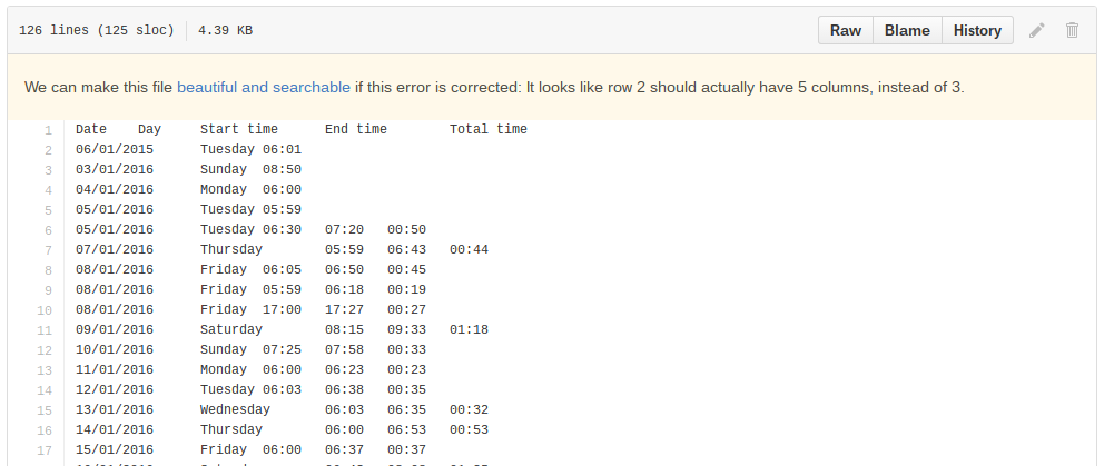
However, I found that in the final columns, where I had no data, there were no tabs copied over, making the resultant file uneven. GitHub gave me a warning saying it couldn’t display my file in a “beautiful” way.

So I created an extra tab in my spreadsheet that pulled through just the columns I wanted.
Then instead of copy-pasting, I simply downloaded this as a .tsv file using Google Sheet’s download options. By downloading this directly, I got all the formatting sorted for me. And by feeding this through to another sheet, I avoided making public data – for example, notes on what the entries are about and my thoughts on writing style in one – which I wanted to keep confidential.
You can see the resulting data file in the Github repository I set up for this experimentation.
My journals
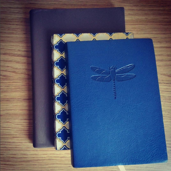
In one column of my spreadsheet I have been noting which journal the entry came from.

This obviously helps me to find an entry and read it. But at some point I also want to note the average number of words per page for a particular journal. Using this information and the approximate number of pages each entry takes up will start to give me rough word counts.
I look forward to seeing approximately how many words I’ve managed to write in the last five months!
Entry types
In another column of my spreadsheet, I have noted the type of entry I have written. This is very approximate and, although I try to use consistent terms, there is no set schema.
For example, I have found eight different types of entry so far:
- Dialogue
- Memories
- Reflection
- Description
- Observation
- Dreams
- Account
However, this might grow or even shrink as I continue to write and re-intepret entries.
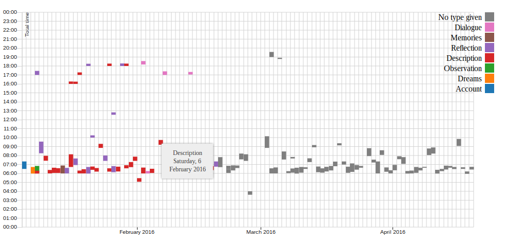
I wanted to recognise these types in the chart. I became interested in knowing if there were particular times or days when I wrote a particular type of entry.
So I created a legend for the chart and coloured the bars accordingly.
I realise that there are probably more effective ways of visualising this if it was the only thing I wanted to monitor but it’s interesting to see this dimension added to the chart.
Gridlines and tooltips
Having said that in looking at the chart it was hard to tell what date a particular entry fell on. I didn’t want to overcrowd the axes but I thought it would be good to see at a glance where in the month an entry was written and what day it actually was. At the very least, it would be good to see if an entry fell on a weekend.
Gridlines
First, I added gridlines – one for each day on the x-axis and one for each hour on the y-axis. I also tidied up the grid a bit so it was easy to read.
To add gridlines, on this type of chart at least, you only need to add ticklines that extend all the way across the chart. I already had some ticks on the axis to show where each month started but it’s easy to add some more.
Tooltips
Even after I’d added these gridlines though, I felt I hadn’t really made it obvious which day a particular entry fell on. Rather than overcomplicated the axis, by noting where a week began or ended, I decided to add some tooltips so if I was interesting in a particular entry I could hover my mouse and see the day and the date.
This was actually surprisingly easy to add although I ended up trying a couple of different approaches.
Result so far
This is how the chart looks so far – with a mouse hovering an entry so the tooltip is showing.

The look of it could do with some work. It’s not too pretty or impressive. But it is getting there and giving me more of an idea of my writing habit this last four-to-five months.
Helpful links
Through all the above, I referred to several articles, tutorials and blog posts. I can’t pretend that my posts on this work as tutorials but for anyway interested in exploring this themselves, I can point you to the areas I found helpful.
- D3 legend example
- “D3.js Step by Step: Adding Tooltips” at ZeroViscosity
- “Using d3-tip [another library] to add tooltips to a d3 bar chart” by Justin Palmer
Next
It’s been a busy week for me, seeing family and meeting deadlines at work. I hope to have more time this week and with the coming longer weekend, to finish some posts I’ve been writing for a while.
On the visualisation side though, I’m looking forward to experimenting more with this, learning the basics, and then starting to see if I can come up with some original ways to view the information, perhaps with some more interesting data.