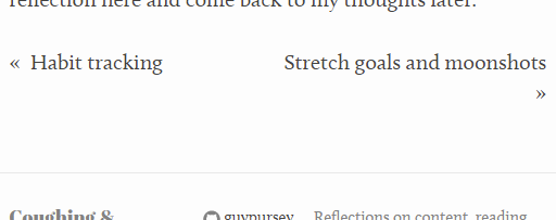
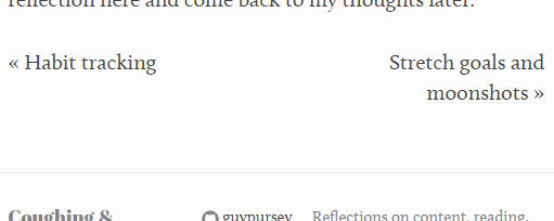
Next and previous links for Jekyll blog posts
Want to add accessible links so your readers can easily move back and forth between Jekyll blog posts? Here’s how I achieved this, automatically.
First, the code
Here’s the HTML code I added to my own _layouts/post.html file (which you should be able to reuse):
<div class="post-nav">
<div>
{% if page.previous.url %}
<a href="{{page.previous.url}}">
<span class="unsighted">Previous post:</span>
<span aria-hidden="true">«</span>
{{page.previous.title}}
</a>
{% endif %}
</div>
<div class="post-nav-next">
{% if page.next.url %}
{% assign next_post_title_array = page.next.title | split: " " %}
{% assign next_post_cape_length = next_post_title_array | size | minus: 1 %}
{% assign next_post_cape = page.next.title | truncatewords: next_post_cape_length, "" %}
{% assign next_post_spit = next_post_title_array | last %}
<a href="{{page.next.url}}">
<span class="unsighted">Next post:</span>
{{next_post_cape}}
<span style="white-space: nowrap;">
{{next_post_spit}}
<span aria-hidden="true">»</span>
</span>
</a>
{% endif %}
</div>
</div>
And, if you do, here’s some SASS you need to add to your _sass/_layout.scss file:
.post-nav {
    display: flex;
    justify-content: space-between;
    flex-wrap: wrap;
    margin-bottom: $spacing-unit;

    div {
      flex: 1 1 0;

      &:first-child {
        padding-right: 0.5em;
      }

      &:last-child {
        padding-left: 0.5em;
        text-align: right;
      }
    }
}

.unsighted {
  border: 0;
  clip: rect(1px, 1px, 1px, 1px);
  clip-path: inset(50%);
  height: 1px;
  margin: -1px;
  overflow: hidden;
  padding: 0;
  position: absolute;
  width: 1px;
  word-wrap: normal !important;
}
The explanation
There’s actually a really good blog post on how to add previous and next links to your blog posts already out there and that’s what I started with.
But something didn’t sit right with me about it, so I decided to try and improve on it.
Here’s the HTML code Bytedude uses in Jekyll’s post layout:
<div class="post-nav">
<div>
{% if page.previous.url %}
<a href="{{page.previous.url}}">« {{page.previous.title}}</a>
{% endif %}
</div>
<div class="post-nav-next">
{% if page.next.url %}
<a href="{{page.next.url}}">{{page.next.title}} »</a>
{% endif %}
</div>
</div>
For each post that’s built by Jekyll for serving, the layout checks if there’s a post before the current one to link to and if there’s one after, using the page.previous.url and page.next.url properties respectively.
That’s simple enough. Where it fell down for me was in the use of the special characters, « and ».
Accessibility
What’s wrong with these symbols?
There’s a list of typographical characters that have no obvious way of reading aloud. For that first arrow character, you might say “previous”, whereas I might say “back” and so on.
This lack of consistency extends to screenreaders which visually impaired users might rely on. Some screenreaders might ignore the characters, which means that user misses out on some extra information which a sighted user would get. And some screenreaders might attempt to read the characters but in confusing ways.
Luckily there’s a way to hide text from screenreaders and have it read something more meaningful instead.
Here’s how I implemented this method for the previous post link section of the code:
{% if page.previous.url %}
<a href="{{page.previous.url}}">
<span class="unsighted">Previous post:</span>
<span aria-hidden="true">«</span>
{{page.previous.title}}
</a>
{% endif %}
And here’s the similar (but not exactly the same) pattern for the next post link, which I came up with at first but had to change later – can you spot the difference?:
{% if page.next.url %}
<a href="{{page.next.url}}">
<span class="unsighted">Next post: </span>
{{page.next.title}}
<span aria-hidden="true"> »</span>
</a>
{% endif %}
In each case, I’ve wrapped the special character (including the non-breaking space character, , which we’ll come to shortly) in a span which hides the character from screenreaders using aria-hidden="true". That way there’s no way that screenreaders should read it out loud.
But I also added explanatory text which screenreaders can see but which won’t be on the display.
This means, instead of the arrow, screenreaders get the text “Previous post” or “Next post”. The arrow is already doing this job visually so I didn’t feel it necessary to show the labels to sighted users as well.
I hid these labels with a class called unsighted which puts the text safely offscreen, although its position in the HTML means it should still get read in the right order.
There are a few different ways of doing this but I used a CSS method for screenreader only text from WordPress’s accessibility team:
.unsighted {
  border: 0;
  clip: rect(1px, 1px, 1px, 1px);
  clip-path: inset(50%);
  height: 1px;
  margin: -1px;
  overflow: hidden;
  padding: 0;
  position: absolute;
  width: 1px;
  word-wrap: normal !important;
}
Fixing up widows (typographic widows, that is)
InDesign’s definition of widows and orphans describes widows as words left hanging alone at the bottom of a paragraph or page.
The non-breaking space character , next to the “next” arrow in Bytedude’s code, was originally there to stop the “next” arrow from becoming “widowed” on its own line.
But in my new accessibile implementation, the next arrow and the non-breaking space and now separated from one another by a <span> tag – which means the non-breaking space no longer works, because the line can break at the span anyway.

This is visually confusing.
I used some additionial Liquid tags to fix it.
{% if page.next.url %}
{% assign next_post_title_array = page.next.title | split: " " %}
{% assign next_post_cape_length = next_post_title_array | size | minus: 1 %}
{% assign next_post_cape = page.next.title | truncatewords: next_post_cape_length, "" %}
{% assign next_post_spit = next_post_title_array | last %}
<a href="{{page.next.url}}">
<span class="unsighted">Next post:</span>
{{next_post_cape}}
<span style="white-space: nowrap;">
{{next_post_spit}}
<span aria-hidden="true">»</span>
</span>
</a>
{% endif %}
Here’s what the Liquid tags are there to do:
- Create an array of the words in the next post’s title, by using Liquid’s
splitfilter with a space. - Work out length of the “cape”. (The “cape” being all words in the title but the last one.)
- Work out how long that array is using
size. - Deduct 1 from the size using the
minusfilter.
- Work out how long that array is using
- Get the “cape” itself – everything but the last word in the title by truncating the title using the cape length.
- Take the last word of the title (which I called the “spit”) by using Liquid’s
lastfilter. - Use the cape to spell out most of the title as usual.
- Wrap the last word of the title and the hidden special character in a span that won’t break or wrap.
With this, the arrow character is once again wedded to the last word of the next post’s title.

Why add post-to-post navigation?
The main reason to point any one of your readers to the blog post before the one they’re reading (or the one after) is to save readers from having to go back to a list of all posts.
If chronological order is relevant at all (and the very format of a blog suggests that it is), then this is a useful feature.
It sounds obvious but in building up my blog from very minimal functionality, I’d missed it until recently.
The extra internal linking can also potentially provide more ways for search engines to crawl a site, which is another benefit.
I started looking into this because I was trying to organise my site with tags and then realised I was missing something much more basic.
Tagging is what I hope to get back to next.