Creating burndown charts for writing
A couple of weeks ago, I wrote a post describing how you can use Trello for reaching consensus, in that particular case around creating a provisional style guide that a team of writers could work with. This post, I outline how you can use a burndown chart to track progress with writing across a team.
A couple of weeks ago, I wrote a post describing how you can use Trello for reaching consensus, in that particular case around creating a provisional style guide that a team of writers could work with. This post, I outline how you can use a burndown chart to track progress with writing across a team.
What is a burndown chart?
A burndown chart is a tool that comes from the agile project management methodology. It’s a simple chart measuring work remaining against time remaining.
Generally speaking, the work remaining is represented by the vertical axis of the chart, the time remaining by the horizontal axis. Each point on the graph represents the work that remains at a particular point in a project’s timeline. Joining the dots as one goes along, one hopefully sees a line that descends from left to right as work is completed. Hence “burndown”.
By coming up with estimates for when certain tasks should be completed it is possible and common to plot a line representing the expected progress over the course of the project. This enables comparison against the line representing actual work. You can look at the lines and see if the project is on target or if the estimates were under- or over-estimated.
Writing project
Our team was tasked with completely rewriting a catalogue of degrees on offer to students looking to enrol at University in 2016.
In order to rewrite the content, each member of the team got a list of courses and contacts. They would arrange meetings with the contacts (or, if meetings proved impossible, they would make phone calls) collect together as many “facts” about the course as they could, check that their recording of the facts was accurate and then write the content.
I want to save talking about how the content itself was written for another post. Once it was written however, each team member had an assigned “buddy” who would read through, edit the content, and make suggestions. Once a page of content had been “buddied” (yes, “buddy” became a verb in this process, and yes, the object of the verb where it had one tended to be the page itself) it was passed to a “senior editing” stage. I say “was” but as I am writing we are actually still going through this process, though we’re towards the end of it.
Finally, once a page had been looked at by a senior editor (me, or one of two of my colleagues on the management side) the original writer had to send it back to the information owner. This was for “sign-off” purposes, though we made it clear early on that we’re only getting in touch to ensure that writing about the courses has not distorted the facts about the course. Once a page has been signed off in this process it’s ready to go live – that is on the website.
When we started the team had to write pages for 250 courses, ostensibly in the space of six weeks.
Using Trello
In creating this process, I worked with a manager to codify it. This is how it looked after that meeting:
- Arranging meeting (E02)
- Gathering information (E03)
- Recording information (E04)
- Signing off information (E05)
- Creating content (E06)
- Buddying content (E07a)
- Editing content (E07b)
- Ready to send out (E10)
I recreated this as a series of lists on Trello. When each team member got their list of courses, they had to create a card for each course in the first list (“Arranging meeting (E02)”), assign themselves to it, and start getting in touch with the relevant people.
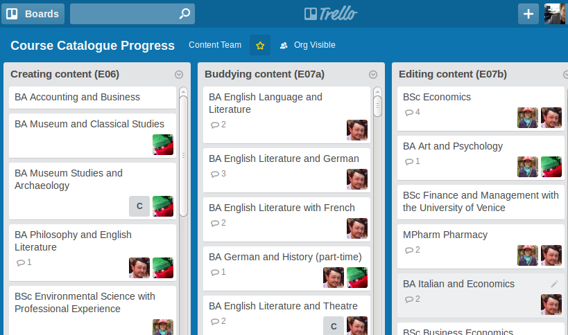
As they moved through the stages they themselves moved cards for courses that were progressing into the appropriate list and assigned their allocated “buddy” the moment they were ready to hand over their writing for somebody else to scrutinise (“Buddying content (E07a)”).
Creating a burndown chart
One of the challenges of creating a burndown chart is abstracting and quantifying the work that needs doing so that it can be simply represented on a chart. In reality, work remaining in the project tends to be a list of tasks, the time for each of which may vary considerably. In this particular project we not only had a series of tasks but the same tasks multiplied by 250. What’s more, one task, say “Gathering information” might be relatively easy for one course but might take a long time for another.
We had a deadline to meet which had been set to slot into other work being done around the website by other teams. After a lengthy couple of meeting with consultants who have been overseeing the various projects being carried out, we settled on a very rough estimate of three hours per course. How we got to this was perhaps to complicated to detail here but this estimate essentially formed the basis of the creation of the burndown chart.
I decided each course would be worth three “points” so that the work remaining would be easily translatable back to time estimates if required. Each stage for each course page would be worth a fraction of those three points.
I broke down each phase to a fraction of three points accordingly and created a table of data on this basis.
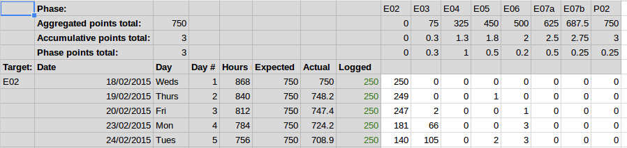
I have been adding a row of figures each morning to this data table showing the number of cards in each phase. With each phase being worth a certain number of points on top, its relatively easy to multiply the number of cards in a particular phase by the accumulated points at that phase and sum them all to produce an overall figure for that day.
Given each card was worth a maximum of three cards and we started with 250 courses, you have probably already worked out that the total number of points and therefore the maximum number on the vertical axis of the burndown chart is 750.
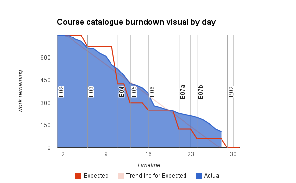
I had already created an estimate of how many points should have passed at each stage so every morning, after I had updated the date, we could review our progress against the estimate in our daily scrum meeting.
I created the table and chart in a Google sheet shared with the whole team so that they could view the chart and also update it in my absence. That way, we kept feedback loops tight and scrums could go ahead without disruption.
Extracting points from Trello
For anyone wondering how I and the team go the figures to put into the burndown data table each day – no, we didn’t have to do anything so unreliable and tedious as actually count them by hand.
It’s possible to export data from Trello in JSON format. I created a bookmarklet that could go in any team member’s browser that would take the JSON and convert it into simple figures. After saving the code I wrote to a bookmarklet anyone needing to update the chart would only need to:
- Go to the “Export JSON” option in the menu for the Trello board.
- Click the bookmarklet created using my code.
- Copy the figures over to the burndown chart.
This seemed the simplest way of handling the chart.
Conclusion
Although we’re not yet finished this part of the project, using the burndown charts in conjunction with the team’s daily scrum meetings seems to have been a useful way to keep everyone informed of progress – from the team who want to see direct results of their progress, even when they can’t see the content for all the typing, and for more senior levels of management who need to know inform others of potential delays.
I intend to evaluate this with the rest of the team once this work is completed, to see if they thought it was effective and if we can do anything to improve it.