Quick-fix for Google Sheets’ organisational chart
This post describes a quick-fix I came up with to get around a short-coming in one particular feature of Google Sheets: namely its organisational chart which can be used to provide a useful visual representation of hierarchical structures.
Using Google Sheets in a team
I’m a big fan of using Google Sheets at work for collating and organising data around projects.
The ability to collaborate on a sheet in real-time is particularly useful and gives it an immediate advantage over the versioning-hell that is working on separate Microsoft Excel files (for example) and then trying to (often manually) merge the data there.
I often use Google Sheets for members of the team to log their own progress and in the past have used gamification to make this more interesting. It all requires a degree of trust in people’s self-reporting but this isn’t much to ask if the team has good morale, a work ethic, and an agreement about the aims of a project.
Recently, we’ve been using Google Sheets to create a site-map. Why we were doing this is a long story, but given the team’s familiarity with Google Sheets for the other purposes I mentioned above and given that this needed to happen quickly, collaboratively, and iteratively, Google Sheets seemed like the best tool to use.
Using the organisational chart
If you’ve already used Google Sheets you’re probably already aware that you can use it, as you can Excel, to create charts based on the data you’ve entered, if the data is clean and organised in an appropriate way.
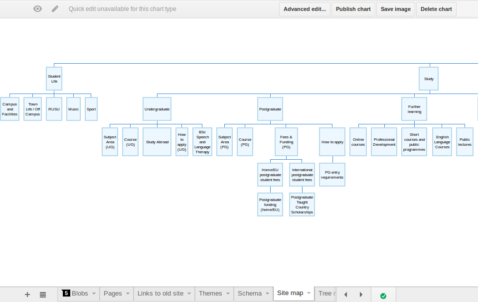
For our site map, we used the organisational chart. We created a column listing pages in our site, then a second column where we could specify the parent of each page. (Pro-tip: use Google Sheets’ data validation feature to ensure that anything in the second column actually exists in the first, thus avoiding problems with the mapping. This will also give you a drop-down and auto-complete on each cell.)
In this way we had a data version of the site map that we could easily change as we adapted and re-organised content and we had a visual representation of that data for reference and for a more intuitive idea of navigation and scale.
Problem with the organisational chart
As we added more and more pages to our first column, selecting existing pages in our second, the site map got unwieldy. Unfortunately, after a certain point Google Sheets cannot fit everything onto the screen by reducing the font-size as it would become illegible so the chart reaches beyond the boundaries of the browser window.
Bookmarklet solution
We realised that manually reducing the font-size, that is by zooming out from the page, we could see more of the chart even as the labels became unreadable. It became obvious that Google Sheets was able to render the number of pages we had but just didn’t fit them on the screen.
With this in mind I created a small bookmarklet that enabled each team-member to add scrollbars to the chart and thus see sections of it previously hidden.
I’ve placed the bookmarklet code on a Gist so that anyone else using this feature of Google Sheets can get around the problem in the same way. Because it’s all on one line and has to be prefixed with javascript:, as a bookmarklet requires, here is the code pretty-printed for convenience and readability:
(function () {
	document.getElementsByClassName("waffle-objwrap-gvizchart")[0].style.overflow = "scroll";
} ())
What next?
I’d like to say more about how we used Google Sheets and how we built our sitemap but I’ll save that for another post.