Playpool charts
Following my experimentations with D3 and with date formatting in recent posts, I started thinking about trying to use some real data I had and how I might represent it. While still primarily interested in “swimlane” charts, I realised that it wasn’t always clear to me which lane each piece of data would sit in. So I started exploring the idea of a freer and more automated representation of this data.
Outsourcing data
The first thing I had to manage was moving away from the original hardcoded sample data and into interchangeable files.
In previous posts, I have simply used data based on the history of kingdoms in East Asia, which was from the original chart I based my own on.
However, for months now I’ve been making notes on a criminal organisation called the ’ndrangheta. In my last post on dates and imprecision, I talked about the book Mafia Republic by John Dickie.
I’ve been keeping my notes in a spreadsheet which records in separate columns, the detail, the page I got the information from, and of course – where it’s relevant and the note is about an event or a period of history – the dates pertinent to that information.
Delimited files
Originally though, the sample data was simply hardcoded as a JavaScript object into the HTML file which also had the chart rendering code.
To make this more flexible, I decided to put the data into a spreadsheet, where I could work with it easily and then export it back out as a tab-delimited file.
I then refactored the code so it could call in the data from this file. I did this with a function of D3 called tsv.
d3.tsv function
The function d3.tsv is very useful in that not only reads the content of a tab-delimited file but is also parses it and transforms into a JavaScript object, which each row of data given properties according the relevant column header.
d3.tsv("kingdoms-data.tsv", processData, function (error, items) {
	// do something with the items returned
}
The function tsv first takes a string – which is the name of the file containing the data to import – and it can then also take an accessor function which can be used to perform an operation on each row of data.
Finally, it takes a callback function within which you can do something with the data as a whole. The argument items shown above in that callback is an array of objects, each object representing a row of data within the spreadsheet, where each property is created with a key of the column header and the value for that particular row.
Refactoring required
Of course now anything I want to do with that data has to be done within this function which is called asynchronously – that is only when the data itself has actually loaded, hence the point of the callback. So I had to quite a bit of reordering of code and this had implications for other parts, which I’ll come to later in this post.
Parser shortcoming
It’s worth noting that, annoyingly, tsv does not just separate by tabs – also picks up anything within quotation marks as a separate column within the data. So with some of my notes which had quotations in them I had to open the tsv file with a text editor and put a backslash in front of all the quotation marks to escape them. This was a simple find-replace job but it’s not exactly elegant.
Even using the d3.dsv function and specifying just the ` ` as the delimiter does not get around this – so treating information bound by quotation marks as separately delimited must be a property inherent to the D3 data parser.
Flexible “chapiters”
Now that I’m able to bring in any tsv file I want, I have another problem: not all the column headers in my data match up with the original sample data I have. Nor should they have to.
Whereas in the sample East Asian kingdoms data, there was a column specifically called lane, in my new data, that doesn’t seem appropriate. For a start, I may decide I want to vary which data I present in different lanes. Then again, I may not even know how my data splits in to lanes. This second point I’ll come to shortly.
Rather than change my data to fit the code, or change the code every time I want to read different data, I decided to create the ability for mapping different columns to the data.
So internally, I will always refer to the starting date time stamp for any row of data as start, the ending one as end and the lane as lane, but I can match these to any column in my data.
I do this through a simple object declaration within the access function which I pass to d3.tsv.
var dataOptions = {
	"start": options.start || "start",
	"end": options.end || "end",
	"lane": options.lane || "lane",
	"id": options.id || "id",
	"dateformat": options.dateFormat || { parse: x => x }
}
Where options are not passed to the function, then defaults are given. So when a column for start dates is not specified, the function will fall back for looking for the start property in each row object.
This will come in useful later for dealing with a problem involving lanes.
I’m tempted to call these options “chapiters” – that looks like a typo, but “chapiter” is word for the piece at the top of the column.
Lane inference
Just as the data was originally hardcoded into the HTML page itself, so were the lanes. This made sense before; it doesn’t anymore.
Previosly a row of kingdoms data looked like this:
{"lane": 0, "id": "Qin", "start": 5, "end": 205}
And an array called lanes was used to map each row to a lane. So the lane value in the row given above is 0, which in the array below is mapped to the value "Chinese".
lanes = ["Chinese", "Japanese", "Korean"]
In extracting the data to a tab-delimited file I also wanted it to make sense without having to refer to the code. So I simply changed the numbers for the strings they were supposed to represent.
However, this then meant the lanes had to calculated based on the data.
For now I have kept the variables laneKeys, lanes, and laneLength in global scope so that they’re accessible and mutable from all functions.
This enabled me put the following into the accessor:
if (!laneKeys.hasOwnProperty(v[dataOptions.lane])) {
	lanes.push(v[dataOptions.lane])
	laneKeys[v[dataOptions.lane]] = laneLength
	laneLength += 1
}
v.lanelabel = v[dataOptions.lane]
v.lane = laneKeys[v[dataOptions.lane]]
It uses the laneKeys as a hash search to see if a lane mentioned in a row of data has already been recorded. If it hasn’t then that lane’s name is added to the hash and also to the array of lane names (lanes) for the renderer to use. The integer laneLength is incremented to reflect the growing number of lanes.
After that the row of data itself has three properties added to it. The lanelabel is the original value of the lane property in the data – ordinarily the label. But the lane property added now gives the integer or key given.
Some refactoring of this code is probably needed – I’m sure it could simplified and that the scoping could be sorted to make it easier to debug if something goes wrong.
But for now, this does a good job of taking externalised data and working out how to put each object in its relevant lane.
Date handling
In my last post on date uncertainty, I described developing a short hand convention for capturing periods of time and I wrote some code that could handle that.
I’ve used that code in the generation of my chart and it’s enabled to use my date notation in the spreadsheets where I’m holding my data.
This feels like a separate function altogether, so I will likely make it a module for Node Package Manager at some point. But I’m only mentioning it here because it’s relevant to my next problem and how I tackled it.
Dealing with overlapping data
As mentioned earlier, it’s not always clear how many lanes I need or what belongs where.
I just know that I don’t that I don’t want data blocks to collide.
In the original East Asian kingdoms data, this wasn’t an issue because no period in history (apparently) overlapped.
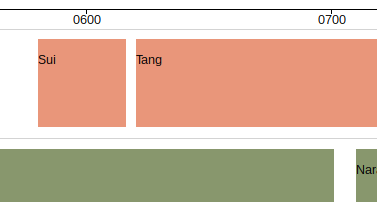
But what if I were to extend the Sui period from when it is said to have ended in 615 to 670, where it would overlap with the start of the Tang period which starts in 620.
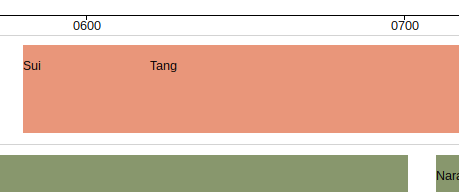
Of course there is a way around this visually, by making the blocks transparent. But this could easily lead to a very cluttered view of the chart where it’s difficult to really compare periods against one another. And if one can’t do that then what does the chart do for you that the raw data can’t?
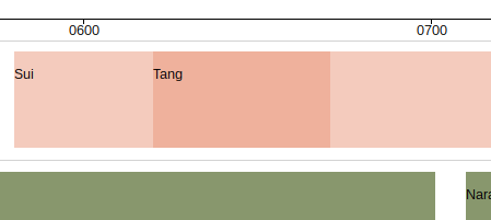
Instead I became interested in seeing if I could stack overlapping areas vertically so that they shouldn’t have to conflict and compromise the readability of the visualisation.
Stretches and splashes
First of all, I decided to change the nature of the visualisation so that there weren’t solid blocks anymore.
I moved away from using bars and into using lines.

I marked the end of each line with a cross to make the line more legible. I also thought I could do more with that cross later. For the time being I settled for colouring it in which gives me an additional way to represent data in the chart for now.
Visually, the crosses also allow for varying scales of “stretch” so that at some scales a stretch may look like a single point. This is important given the date imprecision work I’ve been doing. One can some in to get a sense of precision of date.
Because I’ve been thinking of each lane in the chart as a “swimlane”, I started to see the crosses and lines as “stretches” and “splashes” as if my data were literally swimming beneath the surface of the chart.
Losing the lanelines
The metaphor got my thinking further. What if I could lose the lanes altogether and have a playpool – so instead of an “adult swim” pool, serious and rigorous, laid out for exercise the chart could simply show the data at play, the lanes gone and the armbands on.
To do this I would need to teach my data to swim…
When to automate
Returning to the configuration options mentioned before – the “chapiter” as I called it – I need to make one change to the code. Instead of falling back to lane if a lane option is not specified, the accessor function should fall back to an empty string.
Where lane is falsy, then we can assume that there is no set lane data to organise the data by. At this point, we can default to automatic sorting into “lanes”.
Conflict detection
In order to do this automatic sorting, an algorithm needs to check each row of data and see if any of the time axis it represents is already occupied. If it isn’t, the data for that row can be represented in an existing lane. If it is, however, we need to use another lane or create a new one.
To do this, I’ve introduced a new (for now, global) variable called laneArrays, which will store the actual objects which will appear in lanes.
The automatic lane inference I described earlier needs wrapping in some conditioning so that it is only used if a particular column in the data has been identified as holding the lane data:
if (dataOptions.lane) {
	if (!laneKeys.hasOwnProperty(v[dataOptions.lane])) {
		lanes.push(v[dataOptions.lane])
		laneKeys[v[dataOptions.lane]] = laneLength
		laneLength += 1
	}
	v.lanelabel = v[dataOptions.lane]
	v.lane = laneKeys[v[dataOptions.lane]]
} else {
	assignLanes(laneArrays, 0)
}
If lane has not be configured, then the code will default to assign lanes automatically using the assignLanes function.
var assignLanes = function (laneArrays, i) {
	var updateValue = (v, i) => {
		v.lanelabel = `Lane ${i}`
		v.lane = i
		return v
	}

	var checkConflict = (v, e) => (
		(v.start >= e.start && v.start <= e.end) ||
		(v.end >= e.start && v.end <= e.end) ||
		(e.start >= v.start && e.start <= v.end) ||
		(e.end >= v.start && e.end <= v.end)
	)
	var isConflict = false
	var j

	if (laneArrays[i]) {
		for (j = 0; (j < laneArrays[i].length) && !isConflict; j += 1) {
			isConflict = checkConflict(v, laneArrays[i][j])
		}
		if (isConflict) {
			assignLanes(laneArrays, i + 1)
		} else {
			laneArrays[i][j] = updateValue(v, i)
		}
	} else {
		laneArrays[i] = [updateValue(v, i)]
		lanes.push(`Lane ${i}`)
		laneLength += 1
	}
}
The function carries out all the other crucial work needed to make the data work – assigning lane labels and values as required – but it also works out what those labels and values should be, based on a policy of not conflicting with other rows of data.
The logic for this is represented in six lines, the internal function checkConflict:
var checkConflict = (v, e) => (
	(v.start >= e.start && v.start <= e.end) ||
	(v.end >= e.start && v.end <= e.end) ||
	(e.start >= v.start && e.start <= v.end) ||
	(e.end >= v.start && e.end <= v.end)
)
The v represents the current value and the e every other row that has already been assigned to a lane.
There is probably a more elegant solution for this but I thought this would be the easiest way to check for conflicts for now.
Results
A visual comparison of the two charts probably shows the results more effectively than description can.
Originally, I assigned the “Source” column in my data to the lane dimension. I’ve been using the “Source” column to record which book I got the information from in anticipation of adding notes from further books to my spreadsheet.

Zooming in we can see that the rows of data overlap. This is because the given lane does not account for possible overlaps in the source data.

However, with the automatic lane allocation:
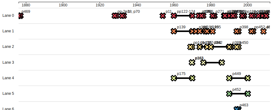
Zooming in gives some idea of how much clearer the data is represented in this way.
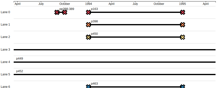
The chart in action
I have uploaded my code to GistHub so that it can be played with directly. This means it’s available through Mike Bostock’s Blocks site, as a page where you can interact with the playpool chart in its current form using some simple sample data.
I decided to hold back uploading my reading notes in all the details for people that might simply want to see how it works in principle.
The simple sample data consists in five rows, where there is no obvious lane to assign, but where there are clearly overlaps in the data. I’ve included it here as a table for viewing.
| ID | Note | Start Date | End Date | Type | Source | Page |
|---|---|---|---|---|---|---|
| Test 1 | 1984 | Test 1 | ||||
| Test 2 | 1982 | Test 2 | ||||
| Test 3 | 198406 | Test 3 | ||||
| Test 4 | 1982 | 1986 | Test 4 | |||
| Test 5 | 1981 | 1986 | Test 5 |
Future work
This has led to a number of jobs I might explore later.
- Extra brush control. At some points too zoomed in and narrow to see. The brush is very difficult to control below a certain width so it would be good to make this easier.
- Colouring abstraction. I want to allow possibility of a custom style sheet based on classes but in the absence of that I’d like the colours to be automatically different enough to tell elements apart if needed.
- Data-based styling. I also want to allow the possibility of the CSS to be over-ridden by values within the data itself. This seems to be possible … if value is present in the data we can use it to generate the fill property for the bar – if not, we’ll leave it blank and the CSS should take over.