Visualising EU referendum results
The United Kingdom voted to leave the European Union in a recent referendum. In the build-up to the referendum and in its aftermath, there have been many claims about the numbers of people who wanted to leave, the numbers who wanted to remain, and the question of voter turnout.
Not political
Before anything else, I want to say this post is not a political one.
If you check my blog for posts over the last few weeks, you will see that I have been exploring visualisations for my own purposes. With the EU referendum and the decision so dominant in both the news and in all my social media feeds I thought it would be an interesting, if slightly risky, topic to explore.
This post isn’t here to offer a view on the UK’s departure from the EU, if it actually happens. Rather there have been plenty of apparently spurious claims on both sides of the debate and I thought data visualisation might help see through some of them.
Dodgy campaign figures
In the build-up to the referendum, both sides used figures that were highly questionable. Here are two examples – and from hereon out, I’ll refer to those who campaigned and those who voted for the UK to stay in the EU as “Remain” and those who were against it as “Leave”.
Remain’s £4,300 claim
The Remain side talked about the potential cost to each household of leaving the European Union – using the very specific figure of £4,300 per household or family.
The BBC’s Reality Check page on costs per household called the figure “questionable and probably not particularly helpful” while the website Full Fact’s analysis of the £4,300 question claimed it was “a red herring” and “an unhelpful summary of the underlying research”.
The figure was a projected cost based on many assumptions. It was not an outright lie but nor was it the whole truth. The UK’s Chancellor George Osborne might have picked any number of other figures from the UK Treasury report on EU membership impact but no doubt went with this one to emphasise the risks involved in leaving. Some even questioned the veracity of the Treasury report itself. This was called by those on both sides sceptical of such claims “Project Fear”.
Leave’s £350m claim
The Leave side talked up the alleged £350m a week sent to Brussels because the UK is part of the EU.
This was a claim about present costs of EU membership and thereby immediately challenged as the UK receives a rebate on that amount before it is actually sent, making the claim both numerically and semantically incorrect.
BBC Reality Check’s page on the money the UK sends to the EU points out the difference between gross and net contributions made.
Soundbite politics
Claims should have been qualified further on both sides. Although John Oliver’s suggestion of what should actually have appeared on the side of the Leave campaign’s battle bus shows the problems with doing that.

This satirical image arguably demonstrates that “soundbite politics” – the reduction of complicated arguments into headline ready phrases – does not allow for considered qualification and makes any such “ifs” and “buts” seem like only so much quibbling.
Aftermath after-maths
While it seems that, since the referendum, the Leave side has gone quiet on these sorts of claims, the Remain side continue to throw around spurious figures.
Does it count?
One serious question, raised mainly by Remain, is whether the referendum result should count or not.
Although figures within the European Union are saying the UK government that it should hurry up and trigger Article 50 of the Lisbon Treaty, which would start the official process of the UK’s departure, there are still questions within the UK as to whether or not the referendum is legally binding and whether it is truly representative.
No “neverendum”
Although the Prime Minister David Cameron has accepted the result, in keeping with his campaign pledge not to have a “neverendum” and that the outcome was a “once in a lifetime” decision, there are many on the Remain side seeking to question the result in any way possible.
This is understable; Cameron claimed this would be a one-time decision because he expected to win. If anything, there is truth to the other claim that we had the country voted to remain, there should be another referendum in the near future to review the decision – after all, we can only leave once, but a decision as to whether we ought to stay probably should be reviewed regularly. (This argument counts in Nicola Sturgeon’s favour.)
Protest claims
Some Remainers are pointing to the fact that only 36% of the electorate voted in favour of leaving. Of course, that’s more than voted to remain but I think the point being made is that some feel the turnout isn’t high enough for such a momentous decision.
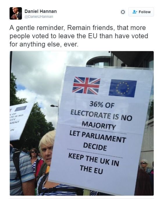
Others call for a second referendum on this basis and that some of those who voted Leave are experiencing what has been called “buyer’s remorse” – having been misinformed or under the illusion that their vote would not count, they voted Leave as a protest vote and therefore another more serious referendum should take place.
Some on the Leave side see this as quite insulting although are somewhat quiet about it – unfortunately leaving only those most unreasonable of voices to speak on their behalf.
Constitutional issues
A second referendum is now seen as increasingly unlikely although there might yet be another referendum on how the UK leaves the European Union, if it even can.
Representatives vs the plebiscite
One way in which the departure might not take place however is through Parliament. There has already been a legal challenge claiming that Article 50 cannot be triggered without being passed through Parliament first. While it is difficult to imagine how Members of Parliament (MPs) could ignore the referendum, it is still conceivable that with roughly three-quarters of MPs in favour of remaining in the EU, the motion might be voted down.
The other union
Another constitutional issue at stake here is that of Scotland and to some extent Northern Ireland. Both countries within the United Kingdom voted to remain in the European Union, while the other two of the four, Wales and England voted to leave.
Some are saying that a decision for the United Kingdom to leave could result in its break-up as Scotland and Northern Ireland seek ways to retain their EU membership.
Back to the data
I’ve become interested in these claims and counter-claims about majorities and turnout and legitimacy, and in particular the figures behind them.
I wanted to explore what could be done with actual data from the referendum itself.
Electoral Commission dataset
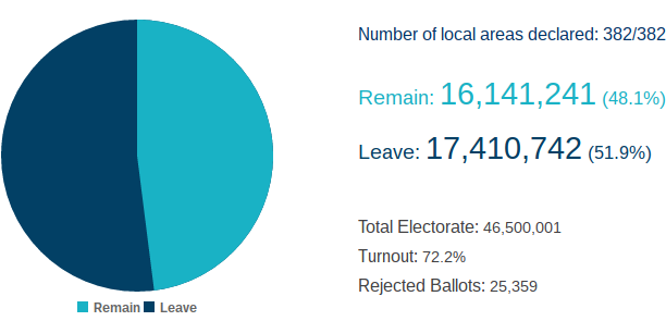
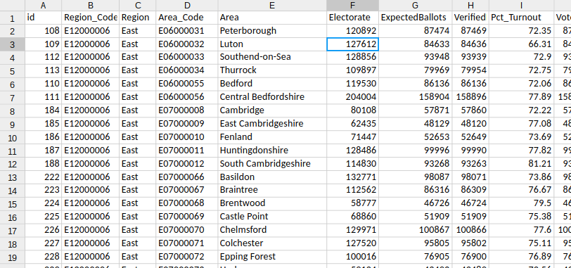
The figures for the votes in each local area, each region and for the UK as a whole are easily available on the Electoral Commission’s EU referendum results webpage. There’s a simple pie chart visualisation there of the results overall and then nested drop-down sections for each region and each area within each area.
Crucially, for me, there’s a CSV of the dataset just waiting to be brought to life through a more interactive visualisation.
Hierarchical bar chart
To get a head-start, I’ve decided to take an existing chart and code and plug the referendum data into it.
After a bit of exploring, I found a D3 visualisation involving a hierarchy of data which seemed like it would be a good fit.
Looking at Mike Bostock’s original code for the hierarchical bar chart, the chart its original form takes its data from a file called readme.json. This contains usual JSON used in most D3 examples (sometimes called flare.json), that has children and grandchildren nested within it.
Because I’m using a CSV of data, I’ve needed to write some that will parse the contents and transform into this hierarchically arranged dataset, similar to the flare JSON.
The original code where this happens simply passes the data, once it’s loaded, to a D3 partition function.
d3.json("readme.json", function(error, root) {
  if (error) throw error;

  partition.nodes(root);
  x.domain([0, root.value]).nice();
  down(root, 0);
})
The original JSON itself looks like this:
{
 "name": "flare",
 "children": [
  {
   "name": "analytics",
   "children": [
    {
     "name": "cluster",
     "children": [
      {"name": "AgglomerativeCluster", "size": 3938},
      {"name": "CommunityStructure", "size": 3812},
      {"name": "HierarchicalCluster", "size": 6714},
      {"name": "MergeEdge", "size": 743}
     ]
    },
    // data continues in this fashion
}
Whereas the original CSV is very much organised as flat rows of data.
Once the data is parsed from the CSV file (so within the asynchronous callback function), the data needs sorting by region.
I’ve declared two variables to help with this – one to help with simply logging each region name as a key and a array I can push each region object to which I’ll then use as the children array of the root:
var regionKeys = {}
var regionArrays = []
Then for each row/object listed in the data from the CSV I’ve checked to see if the region in the list already existing.
If not, I’ve used the region’s name as a key in the regionKeys object, with the value being the next index of the next free space in the regionArrays array.
I then use that space to push an object with the name of the region and an empty children array.
data.forEach(v => {
  if (!regionKeys.hasOwnProperty(v.Region)) {
      regionKeys[v.Region] = regionArrays.length
      regionArrays.push({
          "name": v.Region,
          "children": []
      })
  }
  regionArrays[regionKeys[v.Region]].children.push({
      "name": v.Area,
      "size": v.Remain
  })
})
From there on out, I can push each row as an object to the relevant region’s array.
In this example I’ve based the size of the object on the number given for the Remain votes in the data. However, which value I use here and how I want the chart to display is a question I’ll come to shortly.
Finally, all I’ve needed to do is add the regionArrays array as the children property of an object called root.
root = {
    "name": "overall",
    "children": regionArrays
}
The resulting visualisation shows how adaptable the chart is once the data is arranged correctly.
Of course, this chart shows Remain votes by region and area but not how they compare against the general population for each region. At the moment, it doesn’t tell us very much about all the votes in each region and which way they leaned.
Deciding on values
In order to make the chart useful – to arrange it so that the data tells us something – the right values need to be represented.
For my purposes, I’m less interested in the actual numbers for now as the percentages of votes for each side as compared with turnout in each region or area.
The CSV file from the Electoral Commission actually gives us the percentages to work with – the percentage of those who voted who voted Remain, the percentage of those who voted who voted Leave, and the percentage of the electorate that actually voted, otherwise known as turnout!
Pct_RemainPct_LeavePct_Turnout
To make good on the data, I thought it would be good to show the Remainers and Leavers as a proportion of those who voted, making room to represent those who did not vote or whose vote for whatever reason did not count.
First full chart
You can see the first proper chart I created using these results at blocks.org.
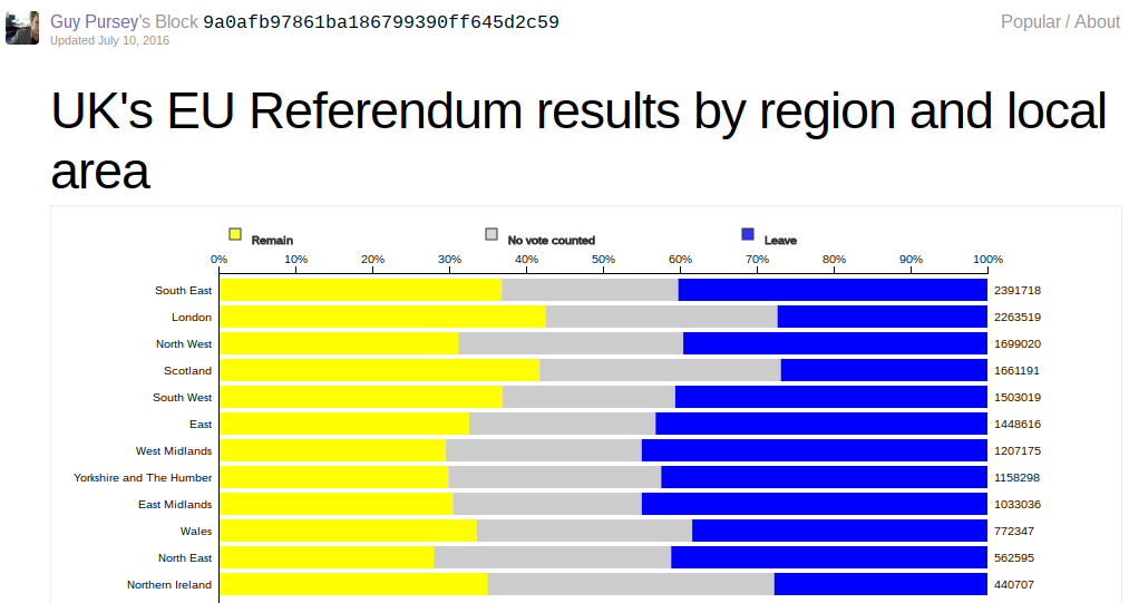
The “Remain” and “Leave” sides are shown respectively on either side of the chart using the colours that were typically show to represent them in the media (perhaps yellow for the “liberal” cause, in keeping with the Liberal Democrats’ party colours, and blue for the nominally small-c “conservative” cause in keeping with the Conservative Party’s colours).
The difference is that the big grey wedge in the middle shows all those who did not voice an opinion through the referendum. The data is effectively sorted by this grey wedge since it represents turnout – the smaller the wedge the higher the turnout.
Data implementation
This was quite difficult to achieve as I need a way to have the values preserved in the original “leafs” of the hierarchy, down at the local area level, but then summatively percolate upwards to the regional and national level.
But D3’s partition function which I’d simply relied on before won’t do that. It simply takes the value (which can be pre-processed with an accessor function but must nonetheless emerge as a single number) and sums up the values for all children at the parent level.
Because I was dealing with percentages, I actually wanted to average (so sum and then divide) the numbers I was dealing with. But I had to do it manually since D3 would only recognise value.
So I wrote more code in the CSV parsing asynchronous callback function to do just that.
Remember the regionArrays where I pushed an object for each row into the relevant region array? Well, I had to modify that to capture more of the original data:
regionArrays[regionKeys[v.Region]].children.push({
    "name": v.Area,
    "remain": v.Pct_Remain,
    "leave": v.Pct_Leave,
    "turnout": v.Pct_Turnout,
    "rawdata": v
})
Then once each child, leaf or area had its own set of figures, I had ensure these were represented properly at the regional level. I did this first within the iterator for each row by accumulatively adding the percentage for each area for the regional figure:
regionArrays[regionKeys[v.Region]].remain += +v.Pct_Remain
regionArrays[regionKeys[v.Region]].leave += +v.Pct_Leave
regionArrays[regionKeys[v.Region]].turnout += +v.Pct_Turnout
But once the iterator was done I had to divide the total for each figure by the length of the array to get the average:
regionArrays.forEach(v => {
    v.remain /= v.children.length
    v.leave /= v.children.length
    v.turnout /= v.children.length
})
Finally, I did this at the national level, by inserting a node between root and the regionals to represent the UK as a whole and by performing an Array.reduce() method on the whole lot:
root = {
    "name": "root",
    "children": [
        {
            "name": "United Kingdom",
            "children": regionArrays,
            "remain": regionArrays.reduce((p, c) => p + c.remain, 0) / regionArrays.length,
            "leave": regionArrays.reduce((p, c) => p + c.leave, 0) / regionArrays.length,
            "turnout": regionArrays.reduce((p, c) => p + c.turnout, 0) / regionArrays.length
        }
    ]
}
This provided the dataset I could actually work with. Then I had to adjust the chart for the actual visual representation.
Visualisation changes
The first main thing was that the axis had to change it as no longer representing a changing number of votes but could stay static as a representation of percentage overall. I wrote this as a function anyway in case I wanted to adapt it later:
var rescale = (items) => x.domain([0, 1])
Once that was done, I introduced a function to calculate the actual percentage for Remain and Leave votes based on the overall turnout.
var calcActualPct = (vote_pct, turnout) => ((vote_pct / 100) * turnout) / 100
Then I used this to create three bars for each row of data within the overall hierarchy.
bar.append("rect")
  .attr("class", "remain")
  .attr("width", d => x(calcActualPct(d.remain, d.turnout)))
  .attr("height", barHeight)
  .attr("x", 0)
  .style("fill", "#ff0")

bar.append("rect")
  .attr("class", "novote")
  .attr("width", d => x(1 - calcActualPct(d.remain, d.turnout) - calcActualPct(d.leave, d.turnout)))
  .attr("height", barHeight)
  .attr("x", d => x(calcActualPct(d.remain, d.turnout)))
  .style("fill", "#ccc")

bar.append("rect")
  .attr("class", "leave")
  .attr("width", d => x(calcActualPct(d.leave, d.turnout)))
  .attr("height", barHeight)
  .attr("x", d => x(1 - calcActualPct(d.leave, d.turnout)))
  .style("fill", "#00f")
I may have explained without much fanfare but this took quite a while to figure out. I think part of the problem was knowing what it was I actually wanted to represent.
Interpretations
As a visualisation, I still don’t think this work has been a complete success. I still don’t think it’s possible to see or glean a great deal from the information in this way, thought one can see patterns beginning to emerge.
For a start, purely in terms of the data, the axis with its current left-to-right 0%-100% format doesn’t help inform about the percentages for any of the three bars in each row.
Also, simply visually, it’s hard to compare one bar with the other as each is skewed. It’s hard to see how to present this more sensibly but some more experimentation may be required.
Summary
I’ve enjoyed exploring visualising this data, particularly in the context of seeing if there might be challenges to various claims being made about these figures. I think there’s potential to do much more useful work with this in the near future.