Visualising EU referendum results (Part 2)
In my previous post on the United Kingdom’s (UK) European Union (EU) referendum, I explored some of the claims made in the lead-up to and aftermath of the vote. I got as far as exploring some of the actual EU referendum voting data by local area from the Electoral Commission and creating my interactive visualisation of the way people voted by region and local area using the D3 JavaScript library.
Quick re-cap
In my previous post on the United Kingdom’s (UK) European Union (EU) referendum, I explored some of the claims made in the lead-up to and aftermath of the vote. I got as far as exploring some of the actual EU referendum voting data by local area from the Electoral Commission and creating my interactive visualisation of the way people voted by region and local area using the D3 JavaScript library.
Not political
Just a quick reminder that I’m not aiming to be political with these posts. I’m interested in exploring figures, seeing what patterns emerge through data visualisation and comparing these against certain claims.
Showing percentages
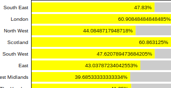
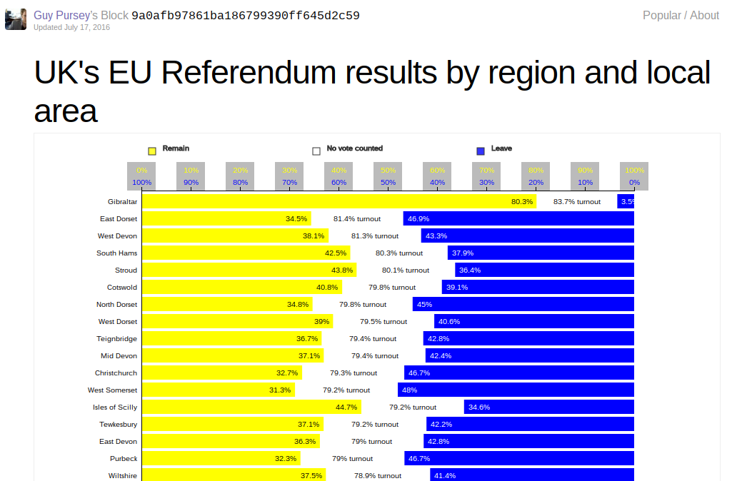
The chart shown in my first post did not make it easy to actually see the percentages.

One x-axis along the top gives a left-to-right 0% to 100% scale, but this does not account for the fact that I plotted the Leave vote bars in blue from the right hand side.
There are a couple of different solutions to this:
- Show the percentages on the bars themselves
- Show a right-to-left axis on top of the left-right axis
I decided to explore both.
Rounding up
Although the percentages in the data are given to two decimal points, regional data are calculated from an average of all the local areas, so the figures can get quite unwieldy.
I wrote a simple little function for now that could round any number up to a given number of decimal points.
var roundUpNumber = (x, p) => Math.ceil(x * Math.pow(10, p || 1)) / Math.pow(10, p || 1)
Applying this function to each figure helps keep the chart tidy and more legible.
The percentages shown in the above image are based on the proportion of the electorate overall who voted for each option, rather than the proportion of the votes themselves.
That is, rather than maintaining that 60.9% of those who voted in Peterborough voted Leave, for example, the chart instead shows that 44.1% of the electorate overall voted Leave, since there the turnout for that area was 72.4%, meaning that, like the UK as a whole, votes were not counted (mostly because those people did not cast votes) for over a quarter of the electorate in that area.
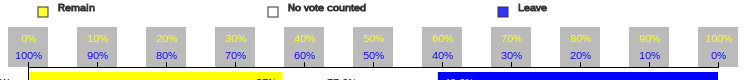
Double axes
To make the x-axis more helpful, I’ve added an extra set of figures so that it also runs 100% to 0% in support of the Leave vote bars starting at the right of the chart.
This was achieved by creating two axes, one based on the original x domain and the other based on a bespoke one:
var xLAxis = d3.svg.axis()
    .scale(x)
    .orient("top")
    .tickFormat(d3.format(".0%"))
    .tickSize(0)
    .tickPadding(25)

var xRAxis = d3.svg.axis()
    .scale(d3.scale.linear().range([width, 0]))
    .orient("top")
    .tickSize(5)
    .tickFormat(d3.format(".0%"))
The axes are simply called in appending an SVG element to the chart:
svg.append("g")
    .attr("class", "x axis remain")
    .call(xLAxis)

svg.append("g")
    .attr("class", "x axis leave")
    .call(xRAxis)
The grey blocks behind each set of figures is an attempt to help make the text more readable – otherwise the yellow text is not clear enough on the white background.
d3.select(".axis")
  .selectAll("g.tick")
  .insert("rect", ":first-child")
  .attr("height", "40")
  .attr("width", "40")
  .attr("y", -40)
  .attr("x", -20)
  .style("fill", "#bbb")
  .style("stroke", "none")
Visually, I think this could do with some improvement. The code could also do with refactoring.
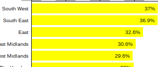
Turnout figure
Between the Remain and Leave bars in each row in the chart, I’ve opted to lose the grey bar and put the turnout figure for the overall row in place.
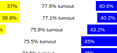
Thi stops any confusion between the grey used in the x-axis and what was previously in the chart and legend. I also think showing the turnout figure is potentially more useful than showing the proportion of people who did not vote.
Update chart
I’ve updated my EU referendum results chart on Bl,ocks.org to reflect all these changes.
Where next?
These extra tweaks have got me thinking about how best to discover more about the data.
At the moment, bars are set on opposite sides from each other which is useful for showing the gap produced by those who did not turn out to vote but not so useful for comparing one side against another.
I started to look at other visualisations to see what I could learn from them.
Other visualisations
I really liked this pretty tree-style visualisation on Remain votes from Codiply. There’s not a whole lot of information in it but it does its job well.
The Financial Times data visualisations on EU referendum results graphed against factors like income and education are much more dense and provide a number of other dimensions and aspects from which to view the outcome of the referendum. They are interesting to the extent that provide other perspectives on the referendum but are otherwise very functional.
The BBC visualisations on how the UK electorate voted overall, and by country and area are admirably clear and provided some basic ideas for me originally, such as the blue and yellow colour scheme, itself taken from the EU flag presumably.
This got me thinking about how I might use arcs in my own visualisation. It might help with comparison of votes while representing other factors.
On a different note, I was inspired by a non-EU related visualisation, namely the Close the Gap charts produced by Studio Metric which focus on the differences between two different sets of figures rather than on the figures themselves as such.
I wondered if instead of showing Remain and Leave vote percentages, there might be some interesting mileage in showing just the differences between the two votes against turnout percentages.
I already know from the data that Gibraltar had both the highest turnout and the highest number of Remain voters. There’s perhaps a hypothesis worth testing in that statement that where there was higher turnout, there might have been more chance of the Remain side winning.
Summary
I feel that, in addition to tweaked and improving the simple chart I originally created, I’ve scrapbooked a few ideas here from other places and come up with some ideas of my own based on this. I’d be interested in exploring this further. I even think there are other very current topics worth exploring and visualising. But I’ll save these for other posts.