Slopegraph in D3 v4: UK general election results 2015-2017 (again)
I casually mentioned last post that I created a slopegraph based on the UK General Election results from 2015 to 2017. After mentioning this, I came to realise it might make a good blog post.
What’s a slopegraph?
It’s also a good opportunity to explain again what a slopegraph is.
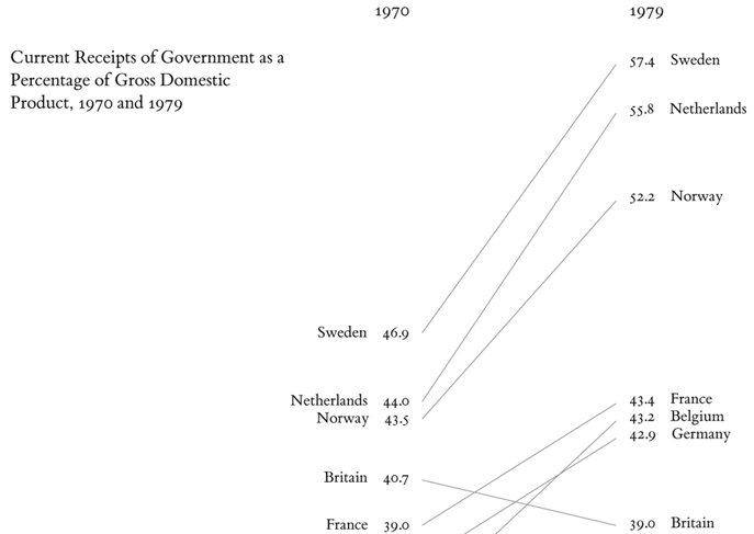
I originally called this type graph a “line graph”. However, Edward Tufte’s post on these types of visualisations with a thread of similar contributions calls each one a “slopegraph”. The word does not appear in Tufte’s The Visual Display of Quantitative Information (1983) but there’s a at least one good example there.
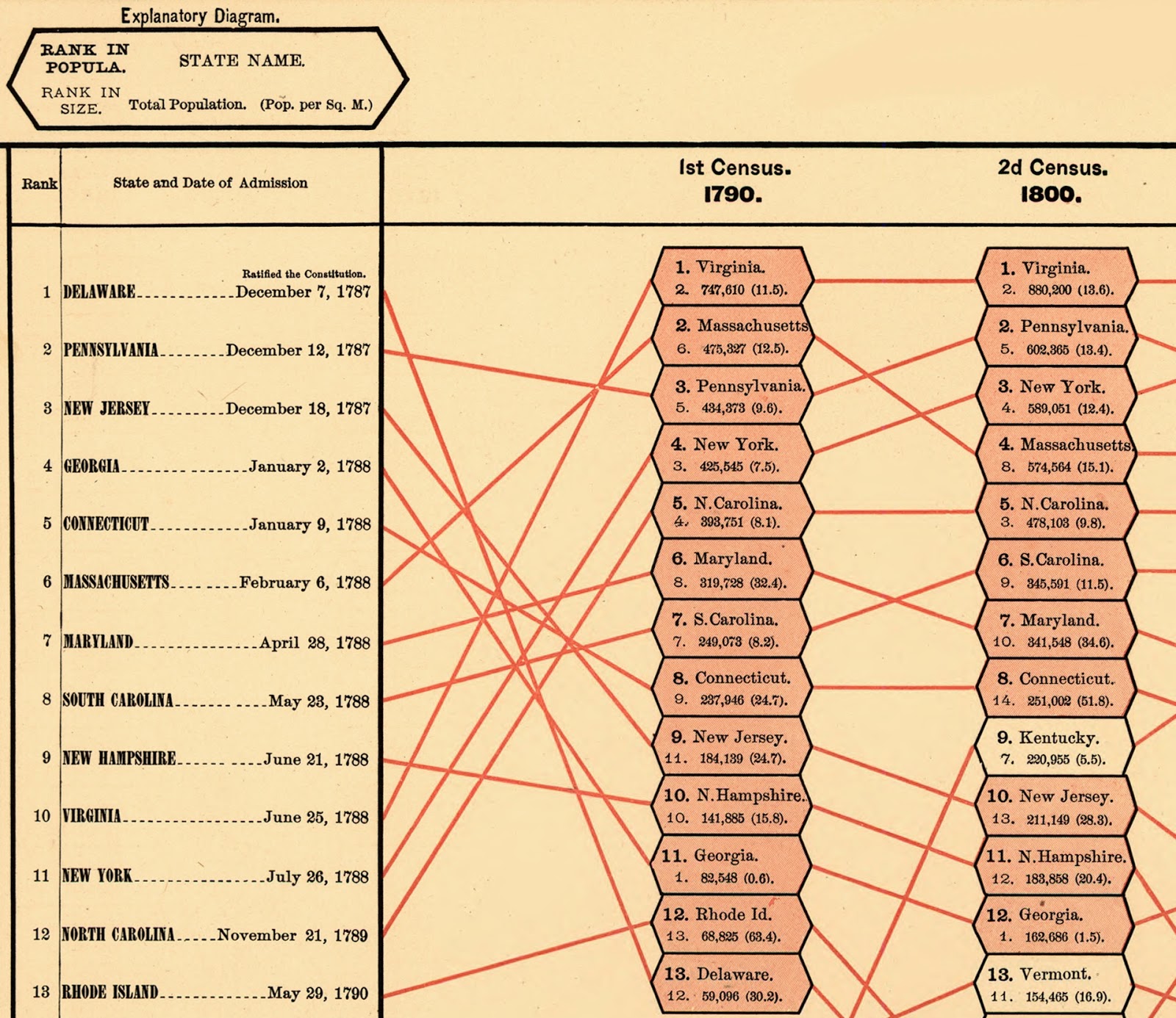
A writer to the thread, Matt Reed, posted the earliest example he found, from 1883 – you can read about it on Matt’s post on Hewes’ and Gannetts’ slopegraph.
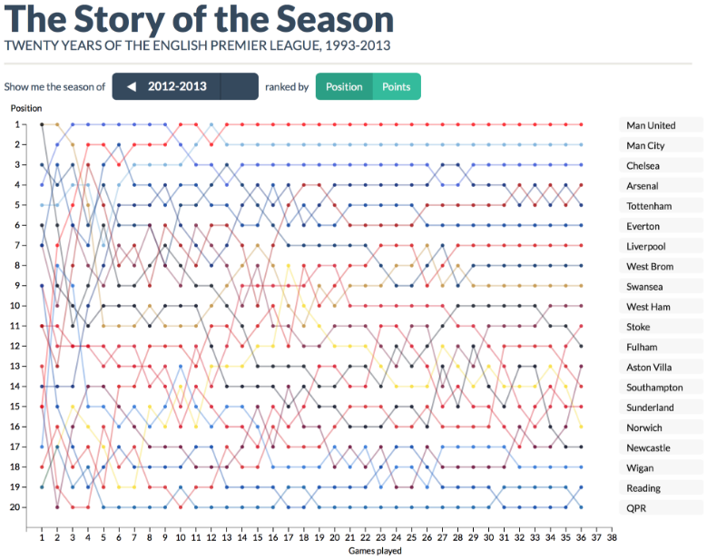
A more recent example I like also on the thread is from the Story of the Season site about changing positions of teams within the English Premier League.
Generally speaking, I like Charlie Park’s definition of a slopegraph as being a line chart that shows “a progression of univariate data among multiple actors over time”.
Creating a slopegraph
When I set out to represent the transfer of seats within the UK House of Commons from the 2015 general election to the 2017 election, I actually thought a slopegraph would not be an effective representation.
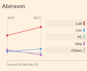
I liked the Financial Times’ slopegraphs which showed the parties’ positions in each seat. But these showed numbers of votes. The secret of the ballot means I cannot show the way each voter’s vote would change, although that would be interesting.
Instead, I was seeking to show the transfer of seats from one party to another, overall, rather than the simple numerical decline. So I created a Sankey graph – you can read my blog post on how I created the Sankey graph to find more about that and my justification for it.
Here though, I want to write about how I created the slopegraph.
Establishing a canvas
First, I basically create add the code to main.js for creating the canvas.
var d3 = require("d3")
d3.legend = require("d3-svg-legend")

var margin = {top: 20, right: 100, bottom: 10, left: 100}
var width = 960 - margin.left - margin.right
var height = 500 - margin.top - margin.bottom

var svg = d3.select("body").append("svg")
        .attr("width", width + margin.left + margin.right)
        .attr("height", height + margin.top + margin.bottom)
    .append("g")
        .attr("transform", `translate(${margin.left}, ${margin.top})`)
Creating axes
Our x-axis can be ordinal – we could make it date-based but we don’t need to. We just need two categories: the 2015 and 2017 general elections.
var x = d3.scaleOrdinal()
    .domain(["2015", "2017"])
    .range([0, width / 2])
I want to leave room for the key so I use width / 2, rather than the full width.
Our y-axis however should be linear. Although because we’re dealing with seats and there’s no such thing as half a seat – unless some unsurprising oddity of British parliament has escaped me – we are dealing only with integers.
var y = d3.scaleLinear()
    .rangeRound([height, 0])
Now we have established the axes we can move on to reading the data.
Reading the data
The data for this slopegraph will be the same data that I talked about before in my blog post on scraping the election results from the Financial Times.
First we read the CSV file and set up a callback function. The rest of our code will go inside this function.
d3.csv("raw.csv", function(error, data) {

    if (error) throw error

    // Everything else here.
})
Then I create a hash table – or in JavaScript parlance, an object – with data about each party for each year.
var partyHashTable = data.reduce((p, c) => {
        p[c["2015"]] = p[c["2015"]] || { "2015": 0, "2017": 0 }
        p[c["2017"]] = p[c["2017"]] || { "2015": 0, "2017": 0 }
        p[c["2015"]]["2015"] += 1
        p[c["2017"]]["2017"] += 1
        return p
    }, {})
We’ll be using this a bit later to create a legend or key for the graph – but for now we need it for the next step.
Using the hash table, we create an array of pairs, one part of the pair being the 2015 result, the other being 2017. There should be a pair for each party so we’ll call it partyPairs.
var partyPairs = Object.keys(partyHashTable)
        .map(k => [{
                "party": k,
                "year": "2015",
                "seats": partyHashTable[k]["2015"]
            }, {
                "party": k,
                "year": "2017",
                "seats": partyHashTable[k]["2017"]
            }])
We’ll be using this to draw the lines of our slopegraph.
Finally, let’s create another variable called partyData which will clump all the pairs together into a single flat array.
var partyData = partyPairs.reduce((p, c) => p.concat(c), [])
We’ll be using this, amongst other things to draw the dots in our slopegraph.
In summary, we have three variables to use:
partyHashTable– for creating the legend or key for the graphpartyPairs– for drawing the lines in our graphpartyData– for drawing the dots in our graph
Extent of the graph
More immediately though, we need to use our partyData to establish how big our graph should be.
y.domain(d3.extent(partyData, d => d.seats))
This should base the extent of the graph on the party with the most number of seats.
With this we will create two y-axes – for these purposes we don’t need an x-axis actually drawn for us, even though we have established the domain and range of an x-axis for the sake of knowing where our dots should go.
svg.append("g")
         .classed("axis", true)
         .call(d3.axisLeft(y))
     .append("text")
         .attr("x", 15)
         .attr("y", -20)
         .attr("dy", "1em")
         .attr("text-anchor", "end")
         .text("2015")

svg.append("g")
         .attr("transform", `translate(${width / 2}, 0)`)
         .call(d3.axisRight(y))
         .classed("axis", true)
     .append("text")
         .attr("x", 15)
         .attr("y", -20)
         .attr("dy", "1em")
         .attr("text-anchor", "end")
         .text("2017")
Notice again that the right boundary is at the half the width of the graph to allow space for the legend or key.
Now we have the boundaries of our graph.
Drawing the dots
So now we want a circle for each datum in partyData.
svg.selectAll(".dot")
            .data(partyData)
        .enter().append("circle")
            .attr("class", d => d.party
                .replace(/\s\(\d{4}\)$/, "")
                .replace(/\s+/g, "-")
                .toLowerCase())
            .classed("dot", true)
            .attr("r", 5)
            .attr("cx", d => x(d.year))
            .attr("cy", d => y(d.seats))
Notice that the party name in each datum – with the year removed from the end and with all spaces replaced with hyphens – becomes the class attribute.
So in main.css, we will add some classes to handle this.
.conservative {
	fill: #6da8e1;
	stroke: #6da8e1;
}

.green-party {
	fill: #65a68c;
	stroke: #65a68c;
}

.sinn-fein {
	fill: #99bf70;
	stroke: #99bf70;
}

// and so on...
These colour hex codes are taken from the Financial Times’ choice of colours.
Connecting the dots
We could actually put this code outside the callback function with the initial axis variables, x and y which we set up.
var line = d3.line()
    .x(d => x(d.year))
    .y(d => y(d.seats))
Either way, it defines which properties of the data we want to determine the drawing of the line – the number of seats up the y-axes and the year to determine which of the y-axes (at either end of the unrendered x-axis) we want to draw.
Within the callback, we use partyPairs to draw each line.
    svg.selectAll(".line")
                .data(partyPairs)
            .enter().append("path")
                .attr("class", d => `line ${d[0].party.replace(/\s\(\d{4}\)$/, "")
                .replace(/\s+/g, "-")
                .toLowerCase()}`)
                .classed("line", true)
                .attr("d", d => line(d))
Note again that the class name is derive from a change in the party name in each datum, so each line will have the same colour as the dots at either end of it.
What we have so far
So far, we have created a chart without that shows connected dots for each party in each of the two most recent elections.
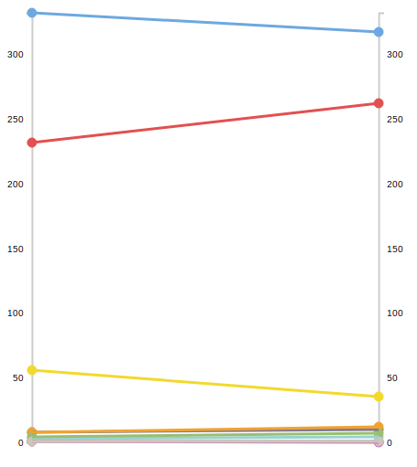
The colours of the dots and lines in the graph suggest the parties they belong to – but it’s not explicit.
Adding a legend
So, finally, I want to add a legend or a key, to explain what each line means using the colours I selected.
I left half the graph space empty for this.
To create the legend I used the d3-svg-legend package created by Susie Lu which I found incredibly simple and easy-to-use.
Walking through steps in the present tense again, I need to install the package while saving it to package.json, using the console command;
npm i d3-svg-legend -S
Then I add the following line underneath my D3 requirement in main.js.
d3.legend = require("d3-svg-legend")
In order to use the package, I need to gather up the party names. Previously you may recall that I handled parties through attributing the party name found in the datum as a class name – with some formatting – so that the CSS can take care of it.
svg.selectAll(".dot")
        .data(partyData)
    .enter().append("circle")
        .attr("class", d => d.party
            .replace(/\s\(\d{4}\)$/, "")
            .replace(/\s+/g, "-")
            .toLowerCase())
However, now I need to think about handling the party names as a separate ordinal scale. We can do this underneath our existing code in the csv callback function.
Let’s introduce a new dimension – and let’s call it z.
var z = d3.scaleOrdinal()
    .domain(Object.keys(partyHashTable)
        .sort((a, b) => partyHashTable[b]["2017"] - partyHashTable[a]["2017"])
    )
    .range(Object.keys(partyHashTable)
        .sort((a, b) => partyHashTable[b]["2017"] - partyHashTable[a]["2017"])
        .map(p => p.replace(/\s/g, "-").toLowerCase())
    )
As you can see this uses partyHashTable, as promised earlier, taking the keys and sorting them in descending order of seats for both the domain and the range. Only for the range, we add a map function to change the labels to classnames, simply by replacing spaces in them with hyphens.
For example, “Liberal Democrat” stays that way for the domain label which we’ll use in our key but becomes liberal-democrat for the corresponding value in the range.
Next we use the space we created for the legend:
    svg.append("g")
            .attr("class", "legendOrdinal")
            .attr("transform", `translate(${width / 2 + margin.left}, 20)`)
The legend library is the used to create the legend which will be applied to the space.
var legend = d3.legend.legendColor()
        .labelFormat(d => d)
        .useClass(true)
        .title("Parties")
        .titleWidth(100)
        .scale(z)
Note that no formatting is needed for the labelFormat; a simple identity function is used. But the useClass method is called with true to show that we want the range values applied as classes.
Finally, we put the two together calling the legend with the space we created:
svg.select(".legendOrdinal")
        .call(legend)
I added the following CSS rules to make it look a bit neater.
.cell .swatch {
	stroke: none;
}

.legendOrdinal text {
	font-family: monospace;
}
The first rule sharpens up the swatches in the legend, stops them looking fuzzy by taking precedence over the party class rules about the stroke attribute. Monospacing the typeface also looks cleaner I feel.
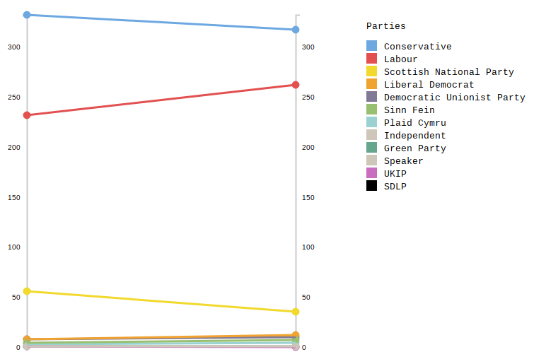
Overall, I think the end result looks okay – though that’s not all I think about it.
Summary
I’m not sure the slopegraph in its current form works for this data.
One message is arguably clear – that two party politics, in terms of seats, has got slightly stronger though not hugely so. The popular vote data is more likely to demonstrate that.
But the graph isn’t helpful overall because the lines at the bottom of it overlap each other so much.
To be truly useful, some interactivity would probably be required and a longer, deeper history of the numbers might be needed.
Future improvements
I can list a number of ideas to improve the presentation of this data which I will possibly look at in a future post.
- Selecting year by axis and reordering the key accordingly.
- Adding years further back.
- Selecting a party in the legend to see just that party’s lines (or to highlight those).
- Connecting the government nodes in each election. (Trickier when there is continuity of government – some other kind of visual cue would be necessary as well as a separate dataset.)
Hopefully though this is a good demonstration of what the slopegraph is and how it might be used.