Tufte’s data design principles and insights
The Visual Display of Quantitative Information, the first book by renowned statistician Edward Tufte, is a wonderful exploration of what does and does not work in data graphics.
Tufte self-published the book in 1982 but it remains relevant and insightful today. It’s full of examples, of both good and bad instances of data graphics, that Tufte uses to draw out general principles that he suggests “apply to most designs”.
I found one example where I disagreed with Tufte, which I’ll come onto later.
Principles vs. insights
Tufte uses the word “principle” throughout the book. Sometimes, the principles themselves appear as a summary at the end of a chapter, but sometimes they’re buried in the middle.
However, although he takes care to define many of the terms used in the book, Tufte never actually defines what he means by “principle”. And what looks like a statement of principle is not labelled as such.
Insights into graphical design are to be gained, I believe, from theories of what makes for excellence in art, architecture and prose.
What follows is a mixture of the explicit principles and implicit insights I noted on a re-read of the book.
Graphical excellence
Tufte clearly sets out the first five principles at the end of the book’s first chapter, “Graphical Excellence”:
- Graphical excellence is the well-designed presentation of interesting data – a matter of substance, of statistics, and of design. [Emphasis is Tufte’s.]
- Graphical excellence consists of complex ideas communicated with clarity, precision, and efficiency.
- Graphical excellence is that which gives to the viewer the greatest number of ideas in the shortest time with the least ink in the smallest space.
- Graphical excellence is nearly always multivariate.
- And graphical excellence requires telling the truth about data.
He provides many examples that follow these principles. And his final point leads into the idea of graphical integrity – that is “telling the truth about data” or, perhaps more aptly, effectively telling the truth with data.
Graphical integrity
Tufte says “Graphical integrity is more likely to result if these principles are followed”:
- The representation of numbers, as physically measured on the surface of the graphic itself, should be directly proportional to the numerical quantities represented.
- Clear, detailed, and thorough labelling should be used to defeat graphical distortion and ambiguity. Write out explanations of the data on the graphic itself. Label important events in the data.
- Show data variation, not design variation.
- In time-series displays of money, deflated and standardized units of monetary measurement are nearly always better than nominal units.
- The number of information-carrying (variable) dimensions depicted should not exceed the number of dimensions in the data.
- Graphics must not quote data out of context.
There are many shocking examples of clear distortions of data to show what happens when these principles are not followed.
Sadly, I’m sure many more examples have risen to prominence in the 17 years since the book was published.
Data-ink
In a chapter simply called “Data-ink”, Tufte describes “data-ink” itself as
the non-erasable core of a graphic, the non-redundant ink arranged in response to variation in the numbers represented.
This is a fascinating idea.
The book includes an illustration of what data-ink and non-data-ink look like in the book.
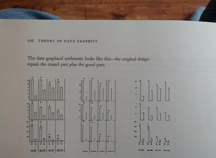
To analyse this, Tufte defines what he calls a “data-ink ratio”: the amount of data-ink divided by “total ink used to print the graphic”.
These days, “ink” might easily be substituted with “pixels”.
Either way, the ratio is about efficiency and reducing clutter, aiding the reader of the data in getting to its meanings more easily.
Five principles appear throughout the chapter, sometimes qualified by the phrase “within reason” – and then again without the qualification at the chapter’s end:
- Above all else show the data.
- Maximise the data-ink ratio.
- Erase non-data-ink.
- Erase redundant data-ink.
- Revise and edit.
These five points feel much more like guidance or instruction on producing one’s own graphs and charts than the earlier principles or insights which were as much about reading graphs and looking out for misleading presentations of data.
Chartjunk
Tufte then describes a specific type of non-data-ink: “chartjunk”.
The nearest we get to a definition is that it is a particular type of “interior decoration” within data graphics. “Interior decoration”, he says
does not tell the viewer anything new. The purpose of the decoration varies […] Regardless of its cause, it is all non-data-ink or redundant data-ink, and it is often chartjunk.
We can infer meaning from the examples he analyses and from the chapter title itself: “Chartjunk: Vibrations, Grids, and Ducks”.
He mentions all three elements of the title in the chapter’s concluding principle:
Forgo [sic] chartjunk, including
moiré vibration,
the grid, and the duck.
You can read more about the terms “moiré vibration”, “the grid”, and “the duck” on Tufte’s webpage about chartjunk, which features excerpts from a few of his books.
Chartjunk is an obvious example of non-data-ink that creators and designers should look for when trying to improve data-ink ratio.
Data density and small multiples
As well as “data-ink ratio”, Tufte also defines “data density”.
The “data density of a graphic” is equal to the “number of entries in data matrix” divided by the “area of data graphic”.
From this, Tufte then sets out two principles:
- Maximize data density and the size of the data matrix, within reason. (p168)
- Graphics can be shrunk way down. (p169)
By following these, one is able to use the saved space to present several similar types of graphs or charts together, leading to “a powerful and effective graphical design”.
Tufte calls this kind of presentation “small multiples” and he may have been the first to popularise the term.
Of multiples in general, Tufte says (p175):
Well-designed multiples are
- inevitably comparative
- deftly multivariate
- shrunken, high-density graphics
- usually based on a large data matrix
- drawn almost entirely with data-ink
- efficient in interpretation
- often narrative in content, showing shifts in the relationship between variables as the index variable changes (thereby revealing interaction or multiplicative effects).
Small multiples reflect much theory of data graphics: For non-data-ink, less is more. For data-ink, less is a bore.
Where Tufte gets it wrong
Relating to that “less is a bore” rule, there’s just one explicit principle in Tufte’s seventh chapter “Multifunctioning Graphical Elements”:
Mobilize every graphical element, perhaps several times over, to show the data.
There are several good examples of this principle being applied in the chapter. Unfortunately, there’s also an example I find dubious.
The example is George Herbert’s poem “Easter Wings”:
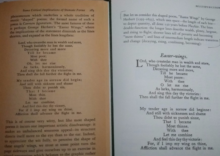
Tufte says:
longer lines describe wealth, plenty, largesse and rising to flight; shorter lines tell of poverty […] and lines of intermediate length indicate transition and change”.
Tufte uses this as another example of how the lines “double function”. Except this is a poem not a visualisation.
For me, this typographical play is a distraction.
Paul Fussell’s Poetic Meter and Poetic Form, another book I continually return to and published eighteen years before Tufte’s, provides some context:
The contribution of line length to meaning is a phenomenon which underlies a whole tradition of exotic “shaped” poems: the formal name of such a poem is Carmen figuratum.
Fussell also uses George Herbert’s “Easter Wings” as an example here noting the implications of its expanding and diminishing line lengths.
This is of course very witty, but like most shaped poems it incurs one important disadvantage: it makes an unbalanced sensuous appeal—its structure directs itself more to the eye than to the ear.
Its appeal to the eye is clearly the reason Tufte chose to include it in The Visual Display of Quantitative Information – even though there is no underlying quantitative information.
But Fussell even criticises its visual form.
Indeed, to appreciate the wit fully, to perceive the shape of these angels’ wings, we must at some point turn the page sideways and give ourselves up to an exercise in visual perception which belongs to the graphic rather than to the temporal arts.
This need to turn the poem “sideways” or rather ninety degrees actually makes this a poor design, even by Tufte’s standards, as well as a poorly conceived poem.
More fundamentally, such poems generally don’t really work as poems.
Perhaps the greatest limitation of shaped poems like [“Easter Wings”] is the scarcity of visual objects which they can imitate: their shapes can reflect the silhouettes of wings, bottles, hourglasses, and altars, but where do we go from there?
Unfortunately, there are probably quite a few places to go from there.
The art of Carmen figuratum is the province perhaps more of the typographer, who works primarily in one sense dimension, than of the poet, who must exactly interfuse two. It is in the delicacy of this joint appeal to eye and ear at once, it is in the perfect harmony of the address to visual and auditory logic at the same time, that any poem achieves its triumphs, and with its triumphs, its permanence.
I agree with the general principle that Tufte articulates in this chapter. But I’d argue it doesn’t apply to poetry, because the lines in poetry are not principally graphical elements. Making them so becomes a distraction akin to chartjunk.
They are also graphically inelegant.
Graphical elegance
Finally, Tufte does not define “graphical elegance” – that would be difficult, since elegance of any kind is hard to pin down – but claims it “is often found in simplicity of design and complexity of data”.
This is why I think that the poem Easter Wings is also inelegant, even by Tufte’s own standard – it is an overly complex design for relatively simple “data” (the idea of wings).
But Tufte draws out more about complexity of (actual) data by making some points about what attractive displays of statistical information should do.
Attractive displays of statistical information_
- have a properly chosen format and design
- use words, number, and drawing together
- reflect a balance, a proportion, a sense of relevant scale
- display an accessible complexity of detail
- often have a narrative quality, a story to tell about the data
- are drawn in a professional manner, with the technical details of production done with care
- avoid content-free decoration, including chartjunk.
The context in which such displays should sit is also important however.
- Data graphics are paragraphs about data and should be treated as such.
With that in mind, Tufte still thinks we ought to be mindful of aspect ratio when it comes to creating graphics wherever they sit. This is evident even in the design of his book, which keeps text to a column about three-fifths of the page but where graphics can take up full-width as needed.
- Graphics should tend toward the horizontal, greater in length than height.
However, this is later qualified by two final points within the chapter.
- If the nature of the data suggests the shape of the graphic, follow that suggestion.
- Otherwise, move toward horizontal graphics about 50 percent wider than tall.
Conclusion
What excites me most about this book is that, by examining day-to-day technical, specific work – presented across many graphs about many different topics – we discover deeper, human insights about facts, truths and storytelling.
I’d highly recommend getting hold of a copy of The Visual Display of Quantitative Information and other Tufte books, all of which provide useful insights accompanied by a wealth of examples.
In the epilogue, Tufte qualifies all the principles and insights he has set out.
The principles should not be applied rigidly or in a peevish spirit; they are not logically or mathematically certain; and it is better to violate any principle than to place graceless or inelegant marks on paper.
He invites his readers to greet any set of principles with “some skepticism [sic]” – which I’ve done in part by focusing on his example of the poem Easter Wings.
Tufte leaves us with a final insight, the closing words of the book, which seem like a fitting way to conclude:
[…] the task of the designer is to give visual access to the subtle and the difficult—that is,
the revelation of the complex.