Observable multi-line multi-series tooltip
I wanted a way to show tooltips on an Observable line chart with multiple data series. But I couldn’t find a readymade solution. So I created one.
Impetus
For months, I’ve been working on a visualisation a private Observable notebook. (I’ll post more about the details of that when I publish it!)
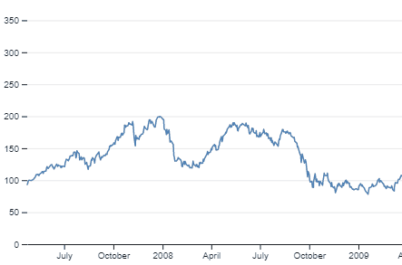
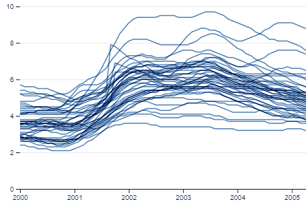
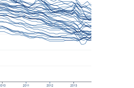
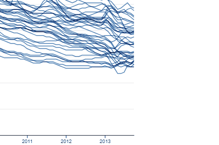
The chart I’ve created allows tracking of different scenarios (hypothetical and real) over time, and for now it shows those scenarios with lines.
I wanted a user of the visualisation to be able to hover over that line at any point and see what the scenario was, and what the value was at that particular point in time.
But I couldn’t find a readymade way to do this.
Existing solutions
In the end, I had to combine code from a couple of different notebooks.
Mike Bostock’s original “Line Chart, Tooltip” notebook had exactly the sort of tooltip I was looking for, where data could be presented on multiple lines.
But Bostock’s “Line Chart, Multiple Series” notebook allowed only a single line to appear when a user hovered over any point on the line, not a proper tooltip.
This seemed like quite a simple thing to fix so I got to it.
Feedback
I forked Bostock’s original multi-series notebook to create my own “Line Chart, Multiple Series, with tooltip” notebook, and then worked out which bits of code from the original tooltip notebook I needed to copy.
I didn’t do anything with the data – I just wanted to demonstrate the method for the tooltip.
Before going back to apply my learning to my original private project, I decided to publish my experiment to build up my meagre portfolio a bit. I didn’t think anything would come of it.
But Gavin Chait, Lead Data Scientist at Whythawk got in touch with me by email to say he found the work useful.
He also had some really useful feedback.
When my tooltip got to the edge of the chart area and went beyond it, it disappeared.
This problem is actually also visible in Bostock’s original notebook.
Gavin’s solution was to change the CSS overflow for the chart but I wondered if it would be possible to rotate or reposition the tooltip based on its position within the chart.
Positional orientation
What I came up with was relatively crude. If the tooltip got within half its own width of the chart’s edge I rotated its position around the data point away from that edge.
When I say “rotated”, I don’t mean literally – the text would not have been legible in that case, so that had to stay the right way up. And if the text was going to stay the right way up but move out of the way, the box itself had to be redrawn.
In the code, box is the path that draws the box, and label is the text inside it:
	const {x, y, width: w, height: h} = label.node().getBBox();
	const hbw = w / 2 + 10; // half the tooltip box's width
	const hbh = h / 2 + 10; // half the tooltip box's height
	const limitW = xScale(X[X.length - 1]); // the cursor coordinates for the edge of the chart
	const switchHW = limitW - hbw; // the point at which to switch the tooltip at the chart's right edge
	const tooltipOver = `M${-hbw},-5H-5l5,5l5,-5H${hbw}v${-hbh * 2}h-${2 * hbw}z`;
	const tooltipUnder = `M${-hbw},5H-5l5,-5l5,5H${hbw}v${hbh * 2}h-${2 * hbw}z`;
	const tooltipLeft = `M-5,${-hbh}V-5l5,5l-5,5V${hbh}H${-hbw * 2}V-${hbh}z`;
	const tooltipRight = `M5,${-hbh}V-5l-5,5l5,5V${hbh}H${hbw * 2}V-${hbh}z`;
	box.attr("d", xm > switchHW ? tooltipLeft : (xm < hbw) ? tooltipRight : tooltipUnder);
	const shiftLabelX = xm > switchHW ? -hbw : (xm < hbw) ? hbw : 0;
	const shiftLabelY = (xm > switchHW || xm < hbw) ? y - (h / 2) + 15 : 15 - y
	label.attr("transform", `translate(${shiftLabelX},${shiftLabelY})`);
I didn’t actually use the SVG codes for the bottom and top edge of the chart, in the end but I wrote them to see how they would work.
The results are in my fork of the multi-series line chart, available for anyone to use.