D3 timescale visualisation
I used existing D3 examples to create what might be an actually useful Gantt chart view of data. Then I found someone else had beaten me to it. Here’s the what, how, and why.
TL;DR
I took an existing D3 chart and tweaked it into something slightly more customised. This is just a start and I hope to do more very soon.
I also put the chart in a place you can play with it, namely on bl.ocks via GistHub, though it’s not different from the original it was based on.
Then I found out that the author of the original chart kind of did all this stuff in a future chart anyway. So this post describes my learning process.
Ongoing experimentation
Following my basic visualisation experiment with D3 based on journal-writing data and the follow-up with tooltips and a legend, I wanted to explore what else might be possible.
For a long time I’ve been interested in what I might do with Gantt charts. This is partly because my job, both nominally and primarily, is project management. Estimating how long projects might run for and how they might overlap and affect each other is important to my job effectively.
I got interested in implementing something like this because there aren’t really any good tools out there that I know of. Here’s what I’ve tried.
Google Sheets
I used Google Sheets a lot, both in my work life and in my personal life. But the suite of charts offered by Google Sheets doesn’t contain a Gantt chart.
I ended up creating a very crude version of a Gantt chart in Google Sheets once but once I added a certain amount to it, it became very slow to load.
Also, it was crude so it was difficult to customise the amount of granularity one might need to see on the fly.
Physical cards
I even tried physical boards to emulate a sort of Gantt chart. In the office, we’ve called it the “lugaijo board” and the “magaijo board”, eventually shortened by a colleague to “magico board”. (The names are clever plays on the first syllables of colleagues’ names turned into semi-meaningful strings of Japanese characters.)
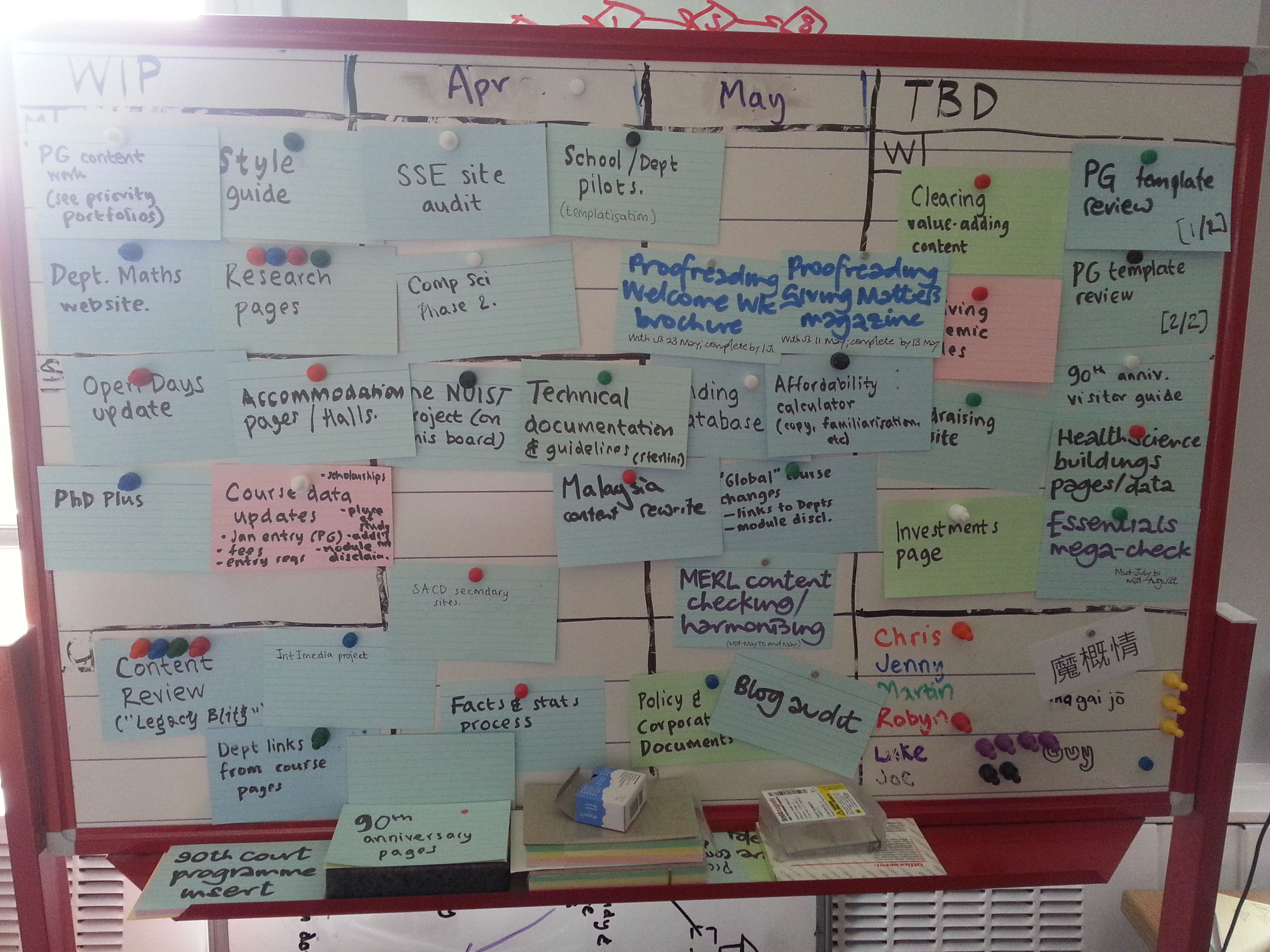
The problem is, again, that it’s too crude, it’s a pain to update and it tried to achieve too much at once. The columns for example not only tried to capture a short window of time ahead of current projects but also roughly what phase a project was in. This kind of dimension-overloading made it difficult to know where a project really was.
I’ve since started to translate this into a digital form using Trello but, in effort to simply what each dimension stands for, it’s became more of a heijunka box board. I’ll write about that another time.
Microsoft Project
Egh… I can use it, I have used it, and I’ve seen it used. It has all the some of the right features – Gantt charts plus recognition of task/phase dependency are two – but I want to be able to work with the actual data.
Plus whenever I have used it I have to spend time explaining what it produces to someone else. Producing my own visualisations or charts has always been more well-received by management and always seems to help the team with knowing where they are too.
Trello
As mentioned above I’m moving project tracking over to Trello now and I use it for tasks within projects too and more besides.
I prefer its simplicity to say Jira, Asana or Flow, but again that’s a post for another time.
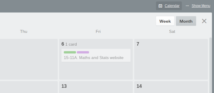
Trello’s date features however leave much to be desired. One can only set a single date for each card (say project, or even task) so the calendar view is very basic.
Other add-on tools exist to produce a Gantt-like view of a Trello board but these seem to require following strict conventions about entering start and end dates into free-text fields. I’m still exploring these options but given that we use Trello to work as a team, trusting everyone to follow all these conventions all the time can prove tricky. It would be much better if the functionality was built in.
Existing D3 examples
I noticed in exploring the numerous examples of D3 usage that there were a few timeline-type charts.
I started looking at these not for work reasons or even because of my recent journal tracking but because I’m interested in analysing and plotting narratives. Again, I’ll explore that in a future post.
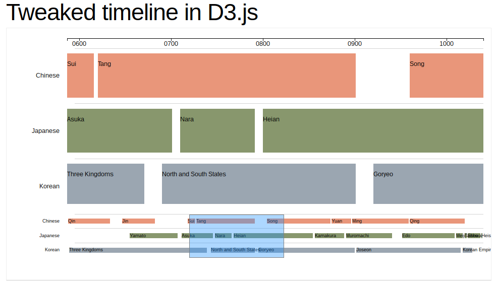
I came across this one particularly good example of a timeline using D3 by Bill Scheidel of LevelStory, which shows lanes of data according to categories and allows variable zooming. Try it.
I found a similar approach to variable zooming on an area chart by Mike Bostock. I was able to compare the code of these two charts to reverse-engineer what was happening.
Later, I found Scheidel actually produced another “swimlane” chart achieving what I wanted to achieve with the axes, but by that point, I’d already put the work in. Having done so will help me take this further.
I have come across a simple and nominal example of a Gantt chart made in D3 but it’s very basic and doesn’t have that ability to focus on particular areas.
Technical details
I decided to take Scheidel’s chart, fix it up a bit and add axes.
Code housekeeping
The first thing I did though was read through the code and clean it up a bit.
- Removed unnecessary line-ending semi-colons. Just clearing out clutter.
- Separated variable declarations. Makes it easier for me to see just how many are being declared.
- Replaced string concatenations with ES6 template literals. This helps me distinguish actual sums from string substitutions.
- Replaced boilerplate for lambdas (anonymous inline
functioncode) with ES6 arrow notation. Easier to see each callback for what it is – namely what goes in and what goes out on each call.
Fixing the initial view
The initial state of the chart showed nothing. You can try it in the example. You have to actively select the area you want before you can see any bars.
I realised this was because the domain of the main chart is set by two variables: minExtent and maxExtent. However, these are based on the brush.extent call which is dependent on the user having selected an area first.
var minExtent = brush.extent()[0]
var maxExtent = brush.extent()[1]
So I added a tertiary operator to determine whether the brush has any values to use first:
var minExtent = brush.empty() ? x1.domain()[0] : brush.extent()[0]
var maxExtent = brush.empty() ? x1.domain()[1] : brush.extent()[1]
This causes the main chart to display immediately. However it also annoyingly caused the brush zone to cover the contextual chart immediately. The brush zone is set by this code:
mini.select(".brush")
    .call(brush.extent([minExtent, maxExtent]))
So I made that conditional on there being brush values too:
if (!brush.empty()) {
    mini.select(".brush")
        .call(brush.extent([minExtent, maxExtent]))
}
Now we have best of both worlds: the main chart displays immediately but the contextual chart is free of clutter ready for the user to make their first selection.
Simple.
Working with dates
Scheidel’s example uses linear scales for both axes.
var x = d3.scale.linear()
	      .domain([timeBegin, timeEnd])
	      .range([0, w]);
var x1 = d3.scale.linear()
	       .range([0, w]);
var y1 = d3.scale.linear()
	       .domain([0, laneLength])
	       .range([0, mainHeight]);
var y2 = d3.scale.linear()
	       .domain([0, laneLength])
	       .range([0, miniHeight]);
The y axes are used purely for plotting out the discrete lanes in the chart rather than scaling anything.
The x axes however work because, even though the data used to plot the rectangles in the chart represent years, the years themselves are easily represented by integers between 0 and 2000.
items = [{"lane": 0, "id": "Qin", "start": 5, "end": 205},
         {"lane": 0, "id": "Jin", "start": 265, "end": 420},
         {"lane": 0, "id": "Sui", "start": 580, "end": 615},
         {"lane": 0, "id": "Tang", "start": 620, "end": 900},
         {"lane": 0, "id": "Song", "start": 960, "end": 1265},
         {"lane": 0, "id": "Yuan", "start": 1270, "end": 1365},
         {"lane": 0, "id": "Ming", "start": 1370, "end": 1640},
         {"lane": 0, "id": "Qing", "start": 1645, "end": 1910},
         {"lane": 1, "id": "Yamato", "start": 300, "end": 530},
         {"lane": 1, "id": "Asuka", "start": 550, "end": 700},
         {"lane": 1, "id": "Nara", "start": 710, "end": 790},
         {"lane": 1, "id": "Heian", "start": 800, "end": 1180},
         {"lane": 1, "id": "Kamakura", "start": 1190, "end": 1330},
         {"lane": 1, "id": "Muromachi", "start": 1340, "end": 1560},
         {"lane": 1, "id": "Edo", "start": 1610, "end": 1860},
         {"lane": 1, "id": "Meiji", "start": 1870, "end": 1900},
         {"lane": 1, "id": "Taisho", "start": 1910, "end": 1920},
         {"lane": 1, "id": "Showa", "start": 1925, "end": 1985},
         {"lane": 1, "id": "Heisei", "start": 1990, "end": 1995},
         {"lane": 2, "id": "Three Kingdoms", "start": 10, "end": 670},
         {"lane": 2, "id": "North and South States", "start": 690, "end": 900},
         {"lane": 2, "id": "Goryeo", "start": 920, "end": 1380},
         {"lane": 2, "id": "Joseon", "start": 1390, "end": 1890},
         {"lane": 2, "id": "Korean Empire", "start": 1900, "end": 1945}]
I like the idea of being more granular than this, particularly if I’m using another dataset, say one with more specific dates.
In theory this should be as simple as changing the type of scale used for the x axes, like so.
var x = d3.time.scale()
          .domain([timeBegin, timeEnd])
          .range([0, w])

var x1 = d3.time.scale()
           .domain([timeBegin, timeEnd])
           .range([0, w])
However for this to work effectively, the integers that represent the start and end years need to become dates. Because of the weird way that JavaScript parses dates, this ended up being longer-winded than I’d hoped. I’ll perhaps cover that in another post but here’s the code.
items = items.map(v => {
    v.start = new Date(`${v.start < 10 ? "0" : ""}${v.start < 100 ? "00" : ""}${v.start}-01-01`)
    v.end = new Date(`${v.end}-12-31`)
    return v
})
This goes through each item and replaces the start integer and end integer with an appropriate Date object, ready to be mapped to the new time-scaled x-axis.
Adding axes
I found working out how to add the axes quite challenging. But the code I used in the end is quite brief and simple and based on what I learned from Mike Bostock’s area chart.
First, I needed to create an area within which to add the x-axis in question. This area (focus) is appended to the main chart.
var focus = main.append("g")
               .attr("class", "focus")

focus.append("g")
     .attr("class", "x1 axis")
     .call(x1Axis)
Then, in the function for re-rendering the boxes, one also includes a line for re-rendering the axis, each time the area of focus changes.
focus.select(".x1.axis").call(x1Axis)
Even though it’s very simple, achieving this felt like a little victory.
Next
There are a number of tasks I want to tackle next:
- Tidying up the code further. A lot a variables could be renamed. And, ugh, tabs vs. spaces.
- Externalising the dataset. Even if I stick with the “chronological diagram of Asia”, it would be good to know this data can be brought in from another file.
- Using this with my own dataset. My previous dataset was of course information on journal entries. However, this won’t work particularly well for this kind of “swimlane” or Gantt-style chart, since the entry dates and times aren’t going to overlap. So I’ll need to find more appropriate data for which this format would be useful.
- Providing a context axis. Should be simple enough to show the dates for selecting of section of chart to view. Could even be on-hover.
- Varying the granularity of the ticks on the axis. So that when one zooms in one can start to see more detail, like decades, years, even months. The spacing of ticks should be appropriate to the level of detail one wants to view in the chart.
- Making it more customisable. It would be good to make the number of lanes more flexible, based perhaps on the data.
- Addressing the aesthetic. It would be good to make the chart look cooler. There are probably some nice design tricks that will make it both easier to use and nicer to look at.