UK General Election 2017 Transfer of Seats (Part 2)
Let’s visualise the changes of seats at the UK’s 2017 General Election in a graph. A Sankey chart to be specific.
First in this post, I’ll reflect on visualisation approaches, then I’ll walk through some code, and finally I’ll present my graph and talk about future improvements I want to make.
Choosing a visualisation approach
Since I started my first post on the 2017 UK General Election changes, I’ve known I wanted to use the data to create a visualisation.
But within this aim are a number of fundamental choices to make. In short:
- Exploratory or explanatory?
- What type of visualisation?
- Which language, library, or framework should I use?
Let’s address each in turn briefly.
1. Exploratory or explanatory
As I read up more on the theory of visualisations, I come to realise how challenging it is to create effective visualisations.
One important distinction I’ve come across is that between exploratory or explanatory visualisations. This is described, with examples, on a page about exploratory vs explanatory visualisations in Indiana University professor Yong-Yeol Ahn’s open online data visualisation course.
Exploratory visualisations aim, as Ahn puts it, “to discover hidden patterns” whereas explanatory visualisations “communicate insights and messages in the data”.
Although it’s worth noting that Ahn adds what it is that good visualisations of each kind manage:
good exploratory visualizations explain what is going on and good explanatory visualizations let people explore the ideas
Reading this got me thinking about which aim I had in mind for my UK General Election visualisation.
It became fairly apparent to me quite quickly that I was not trying to find hidden insights in the data as such – like, for example, patterns across regions or types of voters – but that I was trying to create a simple picture of how the balance of power in the UK shifted on 8th June 2017.
From this reflection, I know that the type of visualisation I want to create for now is explanatory. However, if I want to make it good and I follow Ahn’s guidance, I will need to let users explore ideas through some kind of interaction.
2. What type of visualisation?
In my last post, I mentioned some of the visualisations I liked recently. It occurs to me now that all of them are explanatory. A couple were map-based and the visualisations from the Financial Times that I used to scrape data from were simple but effective line graphs.
I want to show transfer of seats of power.
Slopegraphs
Now, it would be possible for me to create a simple line graph in the style of the Financial Times but instead of visualising the number of votes in each individual seat, this would show the change in the number of seats between two elections.
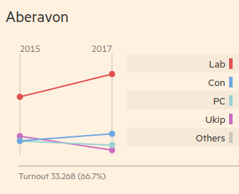
Actually, although I’ve called it a line graph, Edward Tufte’s post on these types of visualisations would call it a slope graph – and it would certainly fit Charlie Park’s definition of a slopegraph as being a line chart that shows “a progression of univariate data among multiple actors over time”.
I have actually created one of these – a slopegraph showing the number of seats changing from 2015 to 2017 – but I’m not convinced it says much. Or rather, it’s not showing what I wanted it to show. Instead I wanted to show the transfer of seats, that is, which party lost seats to whom, or which parties gained seats from others.
Sankey graphs
The best way I can think of to show what I want to show is similar to a slopegraph. It has two axes and shows lines between them to demonstrate changing amounts between one point and another. But it’s also very different. This way is the Sankey diagram.
The Sankey diagram is named for Irish Captain Matthew Henry Phineas Riall Sankey who used it to map energy flows and efficiency.
However, by far the most famous example, predating Captain Sankey’s work, is Charles Minard’s Map of Napoleon’s Russia Campaign from 1868.
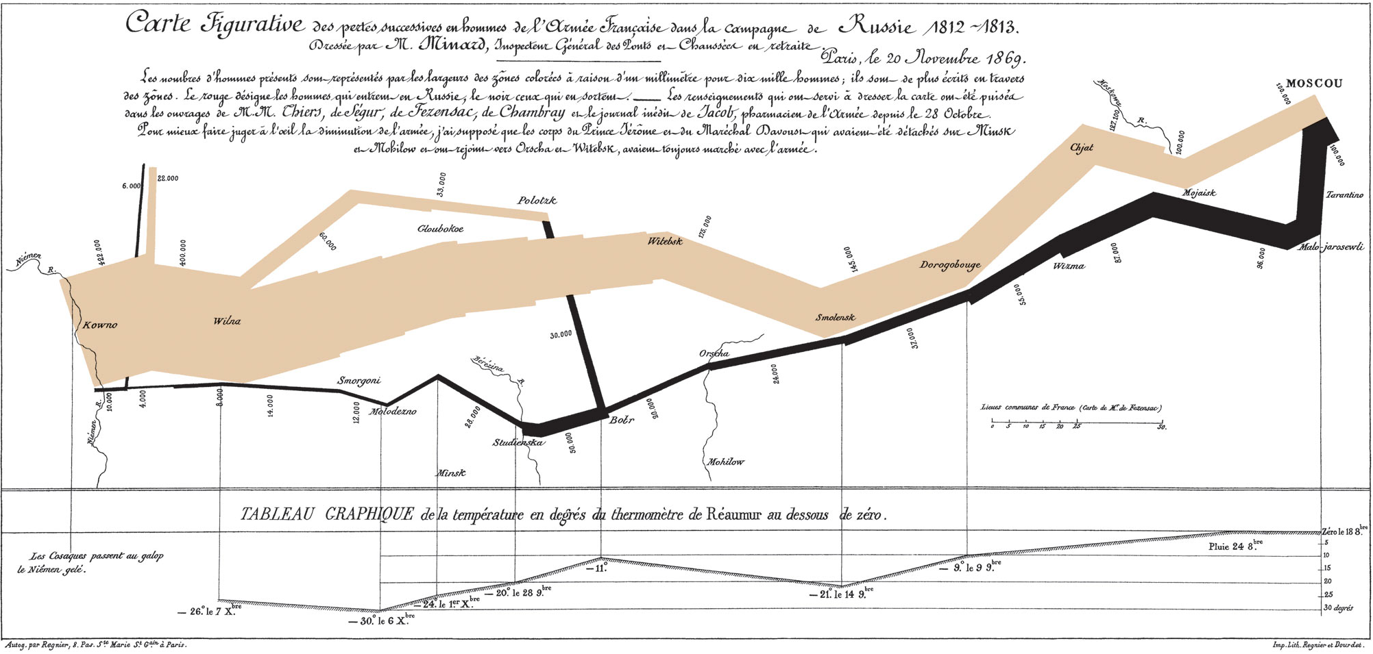
Sankey diagrams are part of a larger group of diagrams called flow diagrams. The width of the bars in a Sankey diagram is normally indicative of magnitude – be it the amount of energy flowing from part of a system to another or in this case, the number of men in a campaign.
Minard’s diagram is not a typical Sankey diagram as it maps the flow across both time and space; notice that the major points in the diagram list locations. A corresponding graph along the bottom even gives an indication of the temperature at each place.
But it’s so striking because it visualises so simply the diminishing numbers – and thereby the increasing mortality – in Napoleon’s army as it marches to Russia and then beats a retreat.
In this way, the Sankey chart can be an extremely powerful explanatory tool in that it can tell a story.
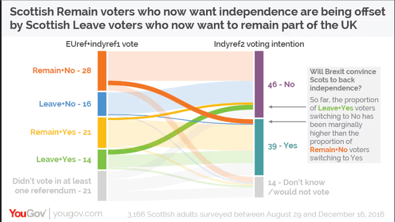
I found one recent politically-related example, a Sankey diagram on Scottish views of independence before and after the UK’s EU referendum vote. I’m not convinced this is the best example of clarity in visualisation; I had to work to make sense of it.
However, The Sankey chart I want to show for now is pretty simple as it only needs to show flows between one year and another.
3. Which language, library, or framework should I use?
I was already pretty decided when I started looking at the data that I would use JavaScript and D3 to do this. But that’s because I’m most familiar, and therefore most comfortable, with these options.
However, it would be interesting to try and implement something in alternative language or framework – this Medium post on online courses about data visualisation recommends several options including Tableau and ggplot.
Code walkthrough
I now have a good idea of what I want to achieve.
Using D3, I want to create a Sankey graph that shows the party blocs in parliament as they resulted from the 2015 election and then the flows of seats from those party blocs to the blocs as they stand after the recent 2017 election.
Grapsing D3-Sankey
There are a few examples of Sankey diagrams on the D3 examples gallery.
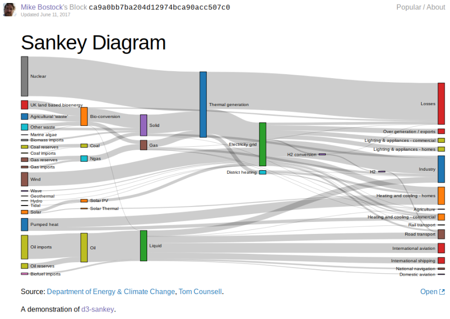
The two I learned most from when putting together mine were Mike Bostock’s Sankey diagram example using data from the US Department of Energy and Climate Change and d3noob’s Sanky Diagram example using simple sample data.
However even with these two clearly coded examples, I struggled.
Both used D3 v4. But Bostock’s was clearly a more static graph and used a hotlinked copy of the official D3 Sankey plugin. Whereas the d3noob example, of which there are many, had moveable blocks which I thought important to the interactivity that would allow users to explore even minimally – but it used a different, older plugin, which did not translate directly.
I was also struggling with integrating this with the D3 and Browserify workflow I posted about previously.
In the end Mike Bostock himself kindly helped when I posted an issue about this on the d3-sankey repository.
Data processing
In the previous post, I explored extracting the election data from the Financial Times breakdown of the results from 2015 to 2017 by constituency.
Now, in order to use that data I need to convert it from the CSV I created – which showed which party had each seat in each year – to a collection of nodes and links. And in order to represent both years and the changes between them, I will need a node for each party in each year.
For example, I will need one node for the Conservatives in 2015 and one for them in 2017. In doing this I can draw the flow between a party in each year by creating a “link” between each node.
Finding pairs
Let’s call our original data CSV file raw.csv. If we load it with D3’s csv method, we can immediately start playing with the data:
d3.csv("raw.csv", function (error, data) {
    if (error) throw error

    // Play with `data` here.

}
The snippets of code that follow will all refer to the data argument passed by d3.csv’s callback function, and they will sit where the comment “Play with data here.” sits.
To see which seats went to whom in aggregate, we want all the unique pairs in that data.
We can find all the unique “blocs” we need through a reduction of the array we get as data from the CSV file.
var blocs = data.reduce((p, c) => {
    p[`${c["2015"]}2015`] = p[`${c["2015"]}2015`] + 1 || 1
    p[`${c["2017"]}2017`] = p[`${c["2017"]}2017`] + 1 || 1
    return p
}, {})
We can also use similar code, slightly adjusted, to find pairs instead of individual blocs:
var pairs = data.reduce((p, c) => {
    p[`${c["2015"]}2015-${c["2017"]}2017`] = p[`${c["2015"]}2015-${c["2017"]}2017`] + 1 || 1
    return p
}, {})
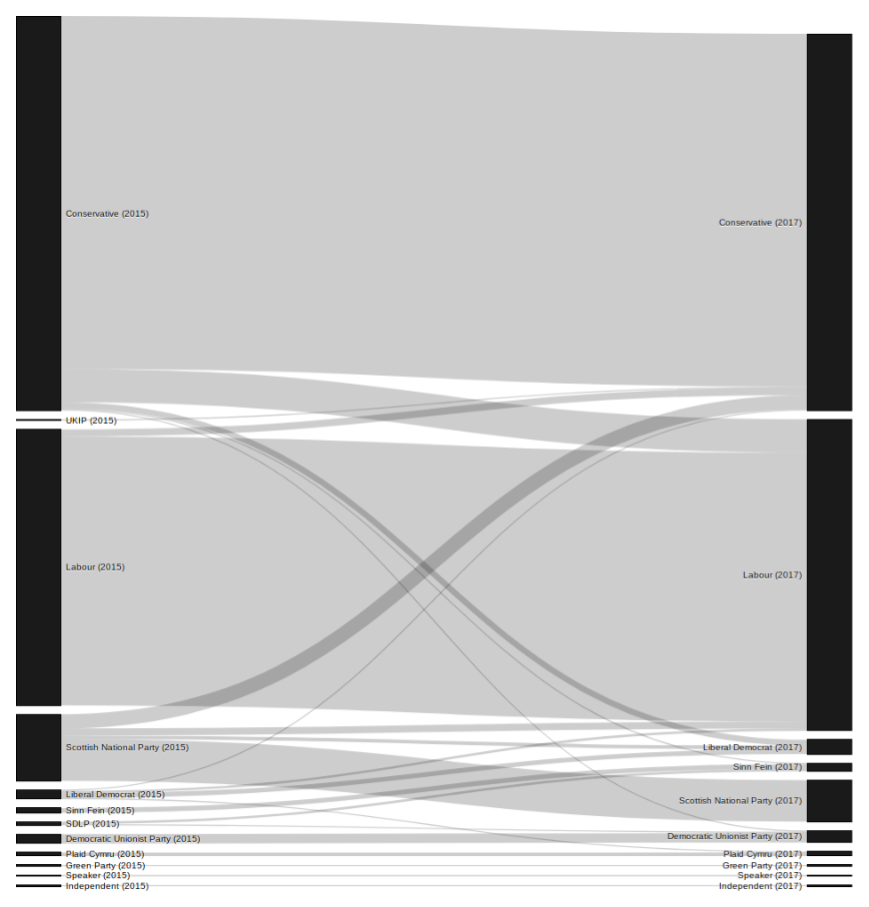
Just by doing this, we can see that the value of Con2015-Con2017 is 297 and the value of Lab2015-Lab2017 is 226. This tells us that the Conservatives held 297 seats whereas Labour held 226.
So our blocs will eventually be used to create nodes in the diagram whereas the pairs contain the data for the links.
But that’s still not it.
Sankeyifcation
I now need to make my data arranged into blocs and pairs into something that I can pass to d3-sankey methods.
With the pairs object, it’s possible to create a set of diffs. Ideally, I want an array of objects, each object containing a source, a target and a value property. The source will signify the holders of seats in 2015, the target their holders now, and the value the number that have either held or changed hands.
var diffs = Object.keys(pairs)
    .map(p => ({
        source: p.replace(/\-.*/, ""),
        target: p.replace(/.*\-/, ""),
        value: pairs[p]
    }))
Here’s what the resulting Labour holding seats diffs object looks like:
{
    source: "Lab2015",
    target: "Lab2017",
    value: 226
}
This diffs object is basically almost what I need to create the connecting link in the graph.
Finally, we can use both blocs and diffs to form an object called graph where the values are processed for the purposes of building the graph.
graph = {
    "nodes" : Object.keys(blocs)
        .map(k => ({ "name": k })),
    "links" : diffs.map(d => ({
            source: Object.keys(blocs).indexOf(d.source),
            target: Object.keys(blocs).indexOf(d.target),
            value: d.value
        }))
}
It’s probably possible to refactor this code and make it even more concise – but it would also be more terse and therefore harder to check.
I did end up refactoring this code slightly so that I could actually order the parties by their share of seats.
This meant dealing with nodes outside of the graph object and then mapping it something simpler in terms of the processing for the links object:
var nodes = Object.keys(blocs)
    .map(k => ({
        "name": k,
        "value": blocs[k]
    }))
    .sort((a, b) => b.value - a.value)

graph = {
    "nodes" : nodes,
    "links" : diffs.map(d => ({
            source: nodes.map(x => x.name).indexOf(d.source),
            target: nodes.map(x => x.name).indexOf(d.target),
            value: d.value
        }))
}
The point is that from this graphs array it’s possible to create a first iteration of the Sankey diagram.
Creating the canvas…
In the HTML file where I want my visualisation to appear, index.js, the body of the source code looks like this.
<body>
    <script src="bundle.js"></script>
</body>
I refer to bundle.js because, as mentioned on my post on Browserify and D3, I use Browserify to handle dependencies for displaying my visualisations in Blocks. So I add my code to main.js and every time I want to view it, I run Browserify to compile the script to bundle.js and see the results in the browser.
Everything else I want to handle through the script for now.
Requirements
At the top of main.js, I start with:
var d3 = require("d3")
var sankey = require("d3-sankey").sankey
var sankeyLinkHorizontal = require("d3-sankey").sankeyLinkHorizontal
The package d3-sankey has of course been installed along with d3 via NPM and you will see this is the file package.json if you look.
Dimensions
I also set up the canvas area where I want the diagram to appear, below my require code:
var margin = {top: 10, right: 10, bottom: 10, left: 10}
var width = 960 - margin.left - margin.right
var height = 1000 - margin.top - margin.bottom

var svg = d3.select("body").append("svg")
        .attr("width", width + margin.left + margin.right)
        .attr("height", height + margin.top + margin.bottom)
    .append("g")
        .attr("transform", `translate(${margin.left}, ${margin.top})`)
This sets up some dimensions and parameters and gives us the variable svg where we can now start appending the graphic elements that will shape our diagram.
Formatting
But just before I do that, I have two more bits of code to add:
var format = d => `${d} seat${(d > 1) ? "s" : ""}`

sankey = d3.sankey()
    .nodeWidth(15)
    .nodePadding(10)
    .size([width, height])
The first line of the snippet above describes how I want the number of seats to be represented – basically for each datum add the word “seat” and if the datum contains a figure higher than 1, add an “s” too.
The second line basically contains formatting for the nodes – representing party blocs in the graph – specifically, how wide they will be and how much space there will be between them, as well as their general size.
Now to the drawing board…
Now we can go back inside our csv callback function, where we processing the data and ended up with a graph object containing a nodes and a links variable.
Packages
Firstly, let’s bring in both our required packages:
sankey(graph)
var path = d3.sankeyLinkHorizontal()
In the first line, the graph is passed to the sankey function to process.
The second line obviously just shows that we can use a shorthand for the function that is returned by calling d3.sankeyLinkHorizontal().
Links before nodes
Next, let’s create the links in the diagram.
This might seem counterintuitive. But we create the links first because we need to know the widths of each link first before we know the width of each node they feed into.
var link = svg.append("g").selectAll(".link")
        .data(graph.links)
    .enter().append("path")
        .attr("class", "link")
        .attr("fill", "none")
        .attr("stroke", "#000")
        .attr("stroke-opacity", 0.2)
        .attr("d", path)
        .attr("stroke-width", d => Math.max(1, d.width))

link.append("title")
    .text(d => `${d.source.name}, → ${d.target.name} ${format(d.value)}`)
The main points to note here are that we use graph.links as the data before we then use enter() to append a path for each – and that the datum for each path is determining by our path function, based on d3.sankeyLinkHorizontal.
Also note that the width of each node, shown as the attribute stroke-width, is set either as the width given in the datum or as 1 so that no bar is smaller than a pixel lest it be invisible.
Nodes and rects
Next, let’s add the code for the nodes, which will come in three chunks:
var node = svg.append("g").selectAll(".node")
        .data(graph.nodes)
    .enter().append("g")
        .attr("font-family", "sans-serif")
        .attr("font-size", 10)
        .attr("class", "node")
        .attr("transform", d => `translate(${d.x0}, ${d.y0})`)

node.append("rect")
    .attr("height", d => d.y1 - d.y0)
    .attr("width", d => d.x1 - d.x0)
    .attr("stroke", "#000")
.append("title")
    .text(d => `${d.name} ${format(d.value)}`)

node.append("text")
    .attr("x", -6)
    .attr("y", d => (d.y1 - d.y0) / 2)
    .attr("dy", "0.35em")
    .attr("text-anchor", "end")
    .text(d => d.name)
.filter(d => d.x0 < width / 2)
    .attr("x", d => 6 + sankey.nodeWidth())
    .attr("text-anchor", "start")
Here we are actually adding nodes and then we’re appending rectangle graphics and text to each of those nodes. This is so that rectangle and text are grouped together and that both can draw on the data from the nodes rather than have data loaded separately into eac.h
A little like the links set up before, we use graph.nodes as our data before appending a group for each datum. Each node is “translated” to the coordinates within its datum despite not being visible.
The visible rectangle that is then appended to each node next already knows where it needs to go – and the height and width are set as the difference between two coordinates in each.
Also note the use of the format function within the title text. This way the party bloc name will appear followed by the number of seats, with the word “seat” or “seats” after it, as mentioned before.
Finally, have a look at the text chunk. Coordinates are calculated, the name is derived from the property in the node datum, and crucially our text additions are then filtered so that only our 2015 entries (those with an x0 less than half the width of the entire diagram and therefore by definition on its left) have their labels adjusted accordingly.
Future improvements
You can see the graph for yourself on Blocks page for the UK 2017 General Election Sankey. But I’m continuously trying to improve this so that the basic code detailed above has had lots of additions and changes since.
For that reason, here’s a picture roughly as it looked when I first got it working.
At the time of writing, I’ve already made changes that I won’t take the time to detail now but which I’ll perhaps describe in a future post. Here is a mixture of things I have already done or want to do following on from the work described above:
- Add party colours to add more meaning to the diagram.
- Make blocs moveable for basic interactivity.
- Sort out ordering of blocs.
- Introduce highlighting of flows relevant to particular nodes for further interactivity.
- Style the diagram to make it clearer and more striking visually.
If I can get to these improvements soon, I may well write a third instalment of these posts to document them.
Summary
I’ve reflected on what it is I was trying to achieve when I said I wanted to visualise the election somehow. I’ve put together a diagram based on the data I scraped (as described in my previous post). And I’ve identified that some clear improvements can be made!
Rather than wait for the next post, you can keep checking on my UK General Election transfer of seats Sankey diagram to see improvements as they are released.