Visualising EU referendum results (Part 3)
There must be an elegant way to represent results from the United Kingdom’s (UK) fairly recent referendum on the European Union (EU) by local area and region and show turnouts and numbers. In this post, I try to articulate the challenges and explore doing this by using the arc features of the D3 visualisation library for JavaScript.
Re-cap
My last couple of posts have explored the EU referendum results through interactive and hierarchical bar charts.
In my first post on EU referendum results, I took an existing bar chart and imported data from the Electoral Commission.
In the post preceding this one, I tweaked this chart, improved it and identified some problems with it.
Challenges
In my last post, I noted some difficulties in reading the visualisation I had produced, specifically that:
bars are set on opposite sides from each other which is useful for showing the gap produced by those who did not turn out to vote but not so useful for comparing one side against another
Of course because I was exploring the D3 visualisation library and adapting existing code, I had not given a lot of thought as to the most appropriate way to display this.
Not political
As I’ve already said in the last two posts, I’m not aiming to be political with these posts. I’m interested in exploring figures, seeing what patterns emerge through data visualisation and comparing these against certain claims.
Stating this is more important now in setting out what I want to achieve. My agenda is a data-driven one rather than a manifestation of a desire to tell a particular story or convey a certain view. That is, I want to work with facts rather than interpretations.
Articulating requirements
Based on the aforementioned challenges, I thought a good place to start would be setting out what I would now like to achieve with the viusalisation.
My aim is to make results of the referendum more legible so that patterns might emerge more easily.
I require the chart to do certain things if I’m to achieve this aim. I can think of these as objectives but I will articulate them as user stories to keep focused on those who might read the charts. Because I’m not approaching this from a political angle, this will help me think about what people might take from the charts.
User stories
Writing user stories, I will use the format “As a user, I want to [x] so that I can [y]”.
- As a user, I want to easily compare Remain and Leave votes against each other at local, regional and national levels.
- As a user, I want to compare the referendum turnouts by local, regional and national levels.
- As a user, I want to see the actual numbers of those who voted either way.
Because there are only three stories here – and perhaps we should call them “epics” rather than stories, as they are still quite broad – I don’t see a need to prioritise them. All three should be achieveable at the same time.
Realisation
With these requirements in mind, I decided to start with one idea: to represent the votes as arcs in a circle rather than bars.
I touched on this idea briefly last post, when I explored the BBC’s presentation of the referendum results.
There didn’t seem to be any particular reason for the BBC to present the results in this way, and they only did this at the national level. Regional results were simply given as bars.
However, it did get me thinking about how showing Remain votes and Leave votes as portions of a circle beginning from the same point but heading in different directions could allow easy comparison of the votes and show turnout.
You can think of this as the bars I displayed in my original hierarchical chart as being bent around to meet at the other end.
Implementation
With this one idea in mind, I decided to start writing my implementation from scratch, though heavily reliant on reference to other materials and code.
Responsive canvas
Since I was writing from scratch I decided I wanted to create my visualisation to be as responsive as possible. I haven’t listed this as a requirement above. Instead I took it to be “hygiene factor”, that is, something that people simply expect.
To achieve this, I’ve had think about how the canvas was going to be created and how to make the Scaleable Vector Graphic (SVG) element, well, scaleable.
With the help of other pages on the topic, including a page on making SVG responsive I found I could add a property to preserve aspect ratio of elements within the SVG.
<div class="svg-container">
	<svg perserveAspectRatio="xMinYMid" class="svg-content-responsive"></svg>
</div>
I’ve then defined the available space within the canvas through width and height constants.
const width = window.innerWidth
const height = window.innerHeight
These I’ve used to define the SVG’s viewBox property which is then used for scaling calculations.
const svg = d3.select("svg")
	.attr("width", `100%`)
	.attr("height", `100%`)
	.attr("viewBox", `0 0 ${Math.min(width, height)} ${Math.min(width, height)}`)
You can see above that I’ve used whichever the smallest of the two constants for both the width and height of the viewBox property. This should stop awkward overflow. It also works quite nicely because I’m using arcs of a circle so I can afford for the size of both sides to be equal.
I’ve used the same approach for creating the first graphic within the SVG canvas and for the arc function which will produce the pieces of the visualisation.
const g = svg.append("g").attr("transform", `translate(${Math.min(width, height) / 2}, ${Math.min(width, height) / 2})`)

const arc = d3.arc()
	.innerRadius(Math.min(width, height) / 2 - 10)
	.outerRadius(Math.min(width, height) / 2)
Finally some simple CSS code ensures everything appears as it should for now:
html, body {
	width: 100%;
	height: 100%;
	padding: 0;
	margin: 0;
}
.svg-container {
	display: inline-block;
	position: relative;
	width: 100%;
	height: 100%;
	vertical-align: top;
	overflow: hidden;
}
.svg-content-responsive {
	display: inline-block;
	position: absolute;
	left: 0;
}
With a responsive canvas set up, I’m ready to dive into the data.
D3 v4
Again, since I was writing from scratch I decided I should use the latest version of the D3 library. Because my previous charts were built by adapting other people’s code, I hadn’t made an active decision about this previously. The charts I had based mine on used D3 version 3 whereas D3 version 4 has been the latest version for a while now.
This posed a challenge as I couldn’t simply copy bits of my old code and re-use it. But a a good challenge as I would need to
Data stratification
For example, in D3 v3, I used a function called d3.layout.partition to arrange the data I imported. D3 v4 rationalises the namespacing of the previous functions a lot and so I’ve had to revisit how my data was being parsed before I could go further.
I started by taking a similar approach to before and went through each item to identify regions. Where a region had not already been logged it was created as an object within an array called regionArray and where it had, the values from item in the original data were added to the values collected so far.
The regionKeys object simply gave me a way of addressing and finding each item as needed.
let regionKeys = {}
let regionArray = []

data.forEach(function (v, i, a) {
	if (!regionKeys.hasOwnProperty(v.Region)) {
		regionKeys[v.Region] = regionArray.length
		regionArray.push({
			"Area": v.Region,
			"Region": "United Kingdom",
			"Electorate": 0,
			"Remain": 0,
			"Leave": 0
		})
	}
	regionArray[regionKeys[v.Region]]["Electorate"] += +v.Electorate
	regionArray[regionKeys[v.Region]]["Remain"] += +v.Remain
	regionArray[regionKeys[v.Region]]["Leave"] += +v.Leave
})
With the regions identified and all the relevant values (in this code above, only “Electorate”, “Remain”, and “Leave”) accumulated, I’ve concatenated them with the original data array and another item to represent the United Kingdom.
let table = [{
	"Area": "United Kingdom",
	"Electorate": regionArray.reduce((p, c) => p + +c.Electorate, 0),
	"Remain": regionArray.reduce((p, c) => p + +c.Remain, 0),
	"Leave": regionArray.reduce((p, c) => p + +c.Leave, 0)
}].concat(data, regionArray)
My idea had been to create a flat table first and then let the D3 v4’s d3.stratify function take care of sorting it all for me, like so:
var root = d3.stratify()
	.id(d => d.Area)
	.parentId(d => d.Region)
	(table)
I immediately hit a problem though.
The Northern Ireland problem
In the data given by the Electoral Commission, Northern Ireland is given as an area. However, it is listed as being in the region Northern Ireland.
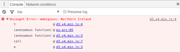
For stratification purposes this is a problem because D3 can’t tell from the name alone which is the parent and which is the child in the relationship.
To get around this, I could simply change one of the names, say for example by appending “Area” to the area name or “Region” to the region name, or both.
This line of code realises the first of those three options and is one I originally added to the forEach loop for the data, mentioned above.
if (v.Region === v.Area) { v.Area = `${v.Area} (Area)`}
However, it did make me wonder if in this case I need the area to be a leaf in my stratified data or if I wouldn’t be better off simply making Northern Ireland a region.
I’ve decided to leave it as it is for now, for the sake of adherence to the original data.
Adding the arcs
With a canvas in place and the data parsed, I’m ready to start creating arcs.
First I start with a simple background arc. I declare a tau constant to help with calculations to begin with.
const tau = 2 * Math.PI
I use tau based on the Tau Manifesto as hinted at in Mike Bostock’s hugely helpful Arc Tween D3 example.
I can then create a grey background arc which goes full-circle.
var background = g.append("path")
	.datum({startAngle: 0, endAngle: tau})
	.style("fill", "#ddd")
	.attr("d", arc)
This goes from angle 0 at the top of the circle implicit in the arc function all the way around to tau (the equivalent of 1 or 100%).
However for representing my Remain and Leave votes, I want them to start from a point at the bottom of the implicit circle so I set that in the arc itself.
arc.startAngle(0.5 * tau)
I can then create example Remain and Leave arcs based on arbitrary numbers.
var remain = g.append("path")
	.datum({endAngle: 0.927 * tau})
	.style("fill", "yellow")
	.attr("d", arc)

var leave = g.append("path")
	.datum({endAngle: 0.127 * tau})
	.style("fill", "blue")
	.attr("d", arc)
The first runs up to 92.7% of the circle and the second to 12.7% – these are only example figures but would represent 42.7% of the vote and 37.3% of the electorate’s vote respectively.
With this seemingly working, I can start to think about applying the actual data to the chart.
Actual percentages
The original Electoral Commission data does give percentage figures for Remain and Leave in each area but these are percentanges of the votes counted rather than the electorate as a whole. For successfully representing turnout, it’s better to use the Electorate, Remain and Leave vote counts themselves to calculate actual percentages for each side.
So I’ve inserted the following code just before the stratification of the table data:
table.forEach(function (v, i, a) {
	v["Actual_Pct_Remain"] = 100 / v["Electorate"] * v["Remain"]
	v["Actual_Pct_Leave"] = 100 / v["Electorate"] * v["Leave"]
})
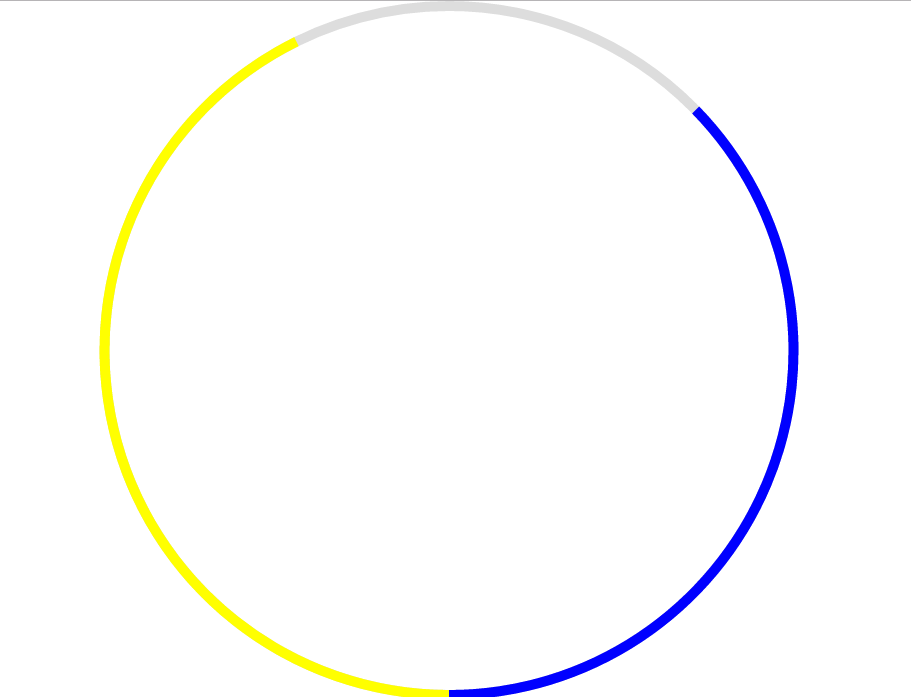
With this, I can quickly mock up some arcs based on the national results (that is, for the whole United Kingdom):
var remain = g.append("path")
	.datum({endAngle: ((root.data.Actual_Pct_Remain / 100) + 0.5) * tau})
	.style("fill", "yellow")
	.attr("d", arc)

var leave = g.append("path")
	.datum({endAngle: (0.5 - (root.data.Actual_Pct_Leave / 100)) * tau})
	.style("fill", "blue")
	.attr("d", arc)
This produces a diagram showing the proportions of the electorate who voted Remain, voted Leave or did not vote at all.
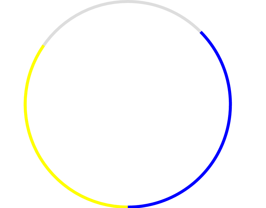
However, I’ve already been able to see this approach may not work for all results.
Decision
In the next steps I will need to decide how I want to render my chart and what the different dimensions will actually mean. Do I vary the width of each example for example to show differences in turnout or simply to show the number of people who voted?
Either option would meet the requirements. It’s worth exploring which method could convey the information more effectively.
With those decisions in mind and more exploration still to come, this seems like a good point to call it a week.
But I should be back with a follow-up post next week.