Visualising EU referendum results (Part 4)
I didn’t have as much time as I wanted this week to explore visualisations further but this is an update on what I did manage.
Re-cap
In three posts now I have explored the EU referendum results through interactive and hierarchical bar charts.
In my first post on the results of the UK’s referendum to leave the European Union, I took an existing bar chart and imported data from the Electoral Commission.
In my second post on the EU referendum results, I tweaked this chart, improved it and identified some problems with it.
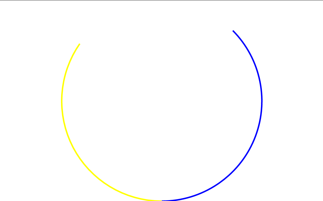
In my third post on the EU referendum results, I explored using arcs to represent the Remain, Leave, and no votes in a circular fashion.
Related to this, last week I decided to take stock and reorganise the visualisation work I have been doing. The process and result are both detailed in last week’s post on building a portfolio with Bl.ocks.
Challenges
In my last post on creating visualisations, I tried experimenting with arcs in an attempt to overcome some difficulties in reading the earlier visualisations I had produced.
This left me with some more fundamential questions about the visualisations. I started using arc segments of a complete circle to present proportions of votes but I hadn’t decided how, if at all, I would represent other information that could be gleaned from the data.
For example, if each region or area was represented by a separate circle, how should they be ordered and what would determine their width relative to one another? What visual relation would the have to the parent arcs? And so on.
Not political
Now time for the standard disclaimer: I’m not aiming to be political with these posts. I started this experimentation to learn more about the D3 visualisation library in JavaScript and also to push myself into new creative ways of thinking about data. It was also an interesting topic at the time, though the news has since moved on to other things or is now exploring the less immediate aftermath of the referendum.
My agenda is a data-driven one rather than a manifestation of a desire to tell a particular story or convey a certain view. That is, I want to work with facts rather than interpretations. But on my fourth post I wonder if not having an agenda is in fact a limitation of exploring these visualisations.
Perhaps I cannot address the challenges or questions listed above unless I have something I want to say or show.
Diameter as Electorate
In my first attempt at answering the more practical questions, I decided to try to approach the visualisation so that width stood for electorate size.
The circle representing the whole of the United Kingdom would be benchmark of maximum width for a circle.
You can then click the circle to access the level below – in the case of the UK circle, this would then open the regional circles below, which, because they represent lower proportions of the electorate, are shown with a much small diameter.

However, this made the region arcs different to see. And the problem is even worse one clicks through to a further level down to the local area arcs.

As a temporary way of labelling the visualisation, I set up each segment of each circle so that it can be hovered over to show the name of the area covered and the statistics for that proportion of the electorate. I also decided it would be helpful to keep each parent circle, albeit faded, as the user goes down each level for use as a reference point.
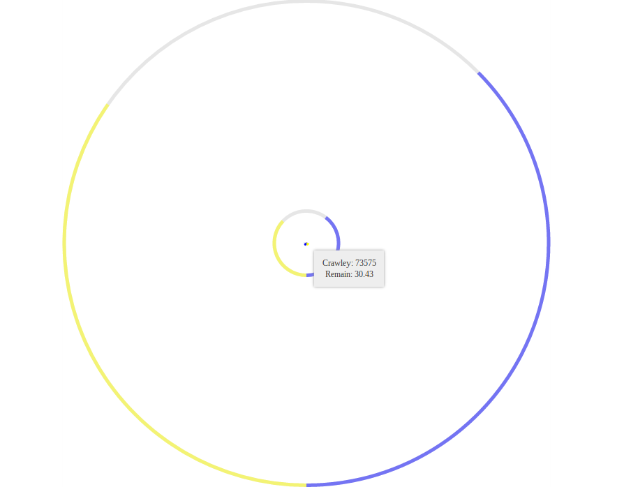
But, with the eventual local areas being illegible, I decided perhaps this was not the best way to visualise the votes.
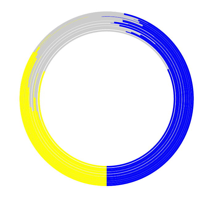
Zooming
I even tried adding a zoom facility to the chart area so that one could take a closer look at the arcs.
It meant writing a few extra lines of code to append to the main containing graphic element in the chart:
.style("pointer-events", "all")
.call(d3.zoom()
	.on("zoom", function () {
			svg.attr("transform", `translate(${Math.min(width, height) / 2}, ${Math.min(width, height) / 2}) scale(${d3.event.transform.k})`)
	})
)
This was pretty simple in the end although took a bit of investigation of different examples and of D3’s sometimes obtuse documentation.

Seeing this, I felt using the electorate figures to determine diameter literally was not going to work.
Diameter as Turnout
Having experimented with using the size of the electorate in each case to determine the diameter of each circle, I thought it would be interesting to try a different approach.
So I decided to make the diameter of each circle dependent on the turnout in each case.
This ended up being just as difficult to read, albeit in a different way. Each arc is large enough to be visible but obstracts the view of other arcs.
The Gibraltar question
Even with both approaches to diameter, I can’t help but feel there are fundamental problems with this style of visualisation.
The original reason for using arcs of a circle to represent proportions of vote (or lack of) was to allow easy comparison of bars. This does not work so well the near the bars get to the top of the circle, where turnout is higher; they become much hard to compare directly and gains can seem marginal even when they might be significant.
Also, like the Northern Ireland vote mentioned last post, the Gibraltar vote provides an interesting edge case.
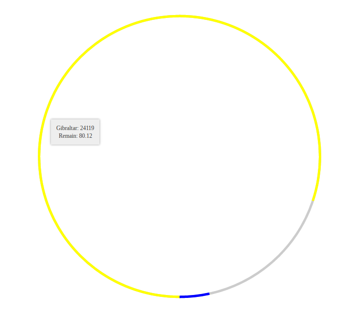
The high turnout and high Remain vote means Gibraltar’s yellow Remain arc comes right round dominating most of the circle and making it very different to many other arcs.
Summary
This has left with lots of questions and issues to puzzle over. I don’t feel I’m much closer to a helpful reprensentation of the results in practice but I’m learning more about D3 all the time and testing my thinking on creative ways to present data.
And my Bl.ocks portfolio now features both the diameter-by-electorate chart and the diameter-by-turnout chart.
Next time I post on this topic I will likely explore angles and different polygons for representational purposes.